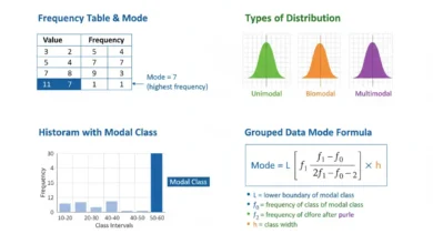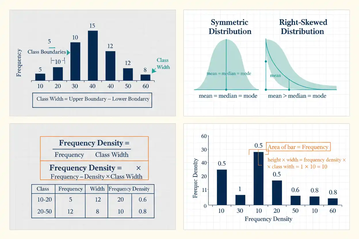
A histogram is a statistical graph that displays the distribution of numerical data by dividing the measurement scale into intervals, called bins or classes, and using adjacent rectangular bars to represent how many observations fall within each interval. Unlike a bar chart, whose bars usually represent separate categories, a histogram uses a continuous numerical horizontal axis, so neighboring bars normally touch and their positions, widths, and areas carry quantitative meaning. When all bins have equal width, bar height can represent ordinary frequency or relative frequency directly; when bin widths differ, frequency density should generally determine bar height so that each bar’s area remains proportional to the number of observations it represents. Histograms are particularly valuable because they reveal features that a single mean or standard deviation cannot show, including symmetry, skewness, multiple peaks, gaps, tail behavior, concentration, and potentially unusual observations. The appearance of a histogram depends strongly on bin boundaries and bin width, which means the same raw data can appear smooth, irregular, unimodal, or even multimodal under different grouping choices. A useful histogram therefore requires both correct calculation and thoughtful construction rather than simply dividing the range into arbitrary intervals.
Within descriptive statistics and the broader Statistics & Probability framework, a histogram provides one of the clearest bridges between numerical summaries and the underlying distribution. It converts the counts organized in a frequency distribution into a visual form that makes location, dispersion, shape, and unusual structure easier to recognize.
What Is a Histogram?
A histogram groups numerical observations into intervals and displays the frequency, relative frequency, or density associated with each interval.
Suppose observations are divided into:
0–10
10–20
20–30
30–40
If the corresponding frequencies are:
4, 9, 12, 5
the histogram contains four adjacent bars.
For equal-width bins, their heights can be:
4, 9, 12, 5.
The tallest bar identifies the interval containing the greatest number of observations.
The graph therefore converts a numerical frequency table into an immediate picture of how observations are distributed across the measurement scale.
Basic Histogram Structure
A histogram has two main axes.
The horizontal axis represents:
numerical values or class intervals.
The vertical axis can represent:
frequency,
relative frequency,
percentage,
or:
frequency density.
Each bar corresponds to one numerical interval.
Because those intervals occupy adjacent regions of a continuous scale, ordinary histogram bars usually touch.
The width of a bar represents the size of its interval, while its height depends on the chosen vertical-axis definition.
Is There a Histogram Formula?
There is no single formula that creates an entire histogram because construction involves choosing class boundaries and then counting observations within them.
Several formulas are central to the process.
For ordinary frequency:
fᵢ = Number of observations in bin i
For relative frequency:
rᵢ = fᵢ/n
For percentage frequency:
Percentageᵢ = 100fᵢ/n
For class width:
wᵢ = Upper boundary − Lower boundary
For unequal-width bins, frequency density is:
dᵢ = fᵢ/wᵢ
These quantities determine the dimensions and interpretation of the bars.
Histogram Frequency
Frequency is the number of observations in a bin.
Suppose:
10 ≤ x < 20
contains:
8 observations.
Then:
f = 8.
If every histogram bin has the same width, a frequency histogram can simply use:
Bar height = Frequency.
The total across all bins must satisfy:
Σfᵢ = n
where n is the total number of observations included in the histogram.
Relative Frequency Histogram
A relative frequency histogram uses:
rᵢ = fᵢ/n
rather than raw frequency.
Suppose:
n = 50
and a bin contains:
f = 10
observations.
Then:
r = 10/50
= 0.20
or:
20%.
The corresponding bar can have height:
0.20
when all bins are equally wide.
Relative frequency is especially useful when comparing samples with different total sizes.
Frequency Density
When histogram bins have different widths, comparing raw bar heights can be misleading because wider intervals naturally cover more of the horizontal scale.
Frequency density corrects for this:
Frequency density = Frequency / Class width
or:
dᵢ = fᵢ/wᵢ
Suppose a bin from:
0 to 10
contains:
20 observations.
Its width is:
10
so:
Density = 20/10
= 2.
A bin from:
10 to 30
containing:
30 observations
has width:
20
and density:
30/20
= 1.5.
Although the second interval contains more observations, its concentration per unit of horizontal scale is lower.
Why Histogram Area Matters
For a frequency-density histogram:
Bar area = Width × Height
Since:
Height = Frequency/Width
we obtain:
Area = Width × Frequency/Width
= Frequency.
Therefore:
Bar area ∝ Frequency.
This is the essential rule for unequal-width histograms.
If raw frequency were used as height for bins of different widths, wide bins would receive too much visual area and the graph would exaggerate their importance.
Equal-Width Histograms
When every class has the same width w:
dᵢ = fᵢ/w.
Because w is the same for every class, density is simply frequency multiplied by one common scaling factor.
Therefore, a graph using:
Height = fᵢ
has exactly the same visual shape as one using:
Height = fᵢ/w.
This is why ordinary frequency is acceptable as bar height in equal-width histograms.
The distinction becomes essential only when widths differ.
Histogram Example
Suppose 50 observations are grouped as follows:
| Interval | Frequency |
|---|---|
| 0–10 | 4 |
| 10–20 | 10 |
| 20–30 | 16 |
| 30–40 | 12 |
| 40–50 | 6 |
| 50–60 | 2 |
Check the total:
n = 4 + 10 + 16 + 12 + 6 + 2
n = 50
Each class has width:
Therefore, the frequency histogram can use bar heights:
4, 10, 16, 12, 6, 2.
The tallest bar is the:
20–30
interval.
Relative Frequencies for the Example
Divide each frequency by:
n = 50.
For 0–10:
4/50 = 0.08
For 10–20:
10/50 = 0.20
For 20–30:
16/50 = 0.32
For 30–40:
12/50 = 0.24
For 40–50:
6/50 = 0.12
For 50–60:
2/50 = 0.04
Therefore:
| Interval | Frequency | Relative Frequency |
|---|---|---|
| 0–10 | 4 | 0.08 |
| 10–20 | 10 | 0.20 |
| 20–30 | 16 | 0.32 |
| 30–40 | 12 | 0.24 |
| 40–50 | 6 | 0.12 |
| 50–60 | 2 | 0.04 |
The relative frequencies sum to:
1.00.
Interpreting the Example Histogram
The distribution rises from:
4 observations
in the first interval to:
16
in the 20–30 interval, then gradually declines.
The modal class is therefore:
20–30.
Most observations fall between:
10 and 40.
Only:
2 observations
fall between 50 and 60.
This pattern gives a much clearer impression of the data’s concentration and tails than simply reporting:
n = 50.
What Is a Bin?
A bin is a numerical interval used to group observations.
For example:
20 ≤ x < 30
is one bin.
Every observation satisfying that inequality belongs to it.
The next interval might be:
30 ≤ x < 40.
By making one endpoint inclusive and the other exclusive, every boundary value is assigned unambiguously.
Good histogram bins should be mutually exclusive and collectively cover all observations intended for the graph.
Bin Boundaries
Suppose classes are written:
0–10
10–20.
An observation exactly equal to:
10
must belong to only one of them.
A precise convention can define:
0 ≤ x < 10
10 ≤ x < 20.
Then:
x = 10
belongs to the second class.
Boundary conventions should remain consistent across the entire histogram.
Otherwise, values exactly on class edges can be double-counted or omitted.
Class Width
Class width is:
Width = Upper boundary − Lower boundary.
For:
10 ≤ x < 20
we have:
Width = 20 − 10
= 10.
For:
20 ≤ x < 50
we have:
Width = 50 − 20
= 30.
Class width influences the amount of detail visible in the histogram.
Narrow bins preserve more local variation, while wide bins smooth over it.
Number of Bins
There is no universally correct number of histogram bins.
Too few bins can hide:
- multiple peaks;
- gaps;
- local skewness;
- unusual concentrations.
Too many can make random sampling noise dominate the graph.
The appropriate choice depends on:
- sample size;
- range;
- distribution shape;
- measurement precision;
- purpose of the analysis.
Examining more than one reasonable binning scheme is often more informative than treating the first histogram as uniquely correct.
Square-Root Rule
A simple heuristic for choosing the number of bins is:
k ≈ √n
where:
k = number of bins
and:
n = sample size.
For:
n = 100
this gives:
k ≈ √100
= 10 bins.
This rule is easy to use but does not adapt specifically to skewness or outliers.
It should therefore be regarded as a starting point rather than an optimal formula.
Sturges’ Rule
Another traditional heuristic is:
k ≈ 1 + log₂(n)
or equivalently:
k ≈ 1 + 3.322log₁₀(n).
For:
n = 100
we obtain:
k ≈ 1 + 6.644
≈ 7.644.
This suggests about:
8 bins.
Sturges’ rule often produces relatively few bins for very large samples and may oversmooth complex distributions.
It remains useful as a simple reference point.
Scott’s Rule
Scott’s rule proposes a bin width:
h = 3.5s/n^(1/3)
where:
- h = bin width
- s = sample standard deviation
- n = sample size
The rule incorporates both sample size and dispersion.
As n grows:
h decreases approximately as n^(−1/3),
allowing more detail to appear.
Because the formula uses standard deviation, it can be influenced by extreme observations.
Freedman–Diaconis Rule
The Freedman–Diaconis rule uses:
h = 2(IQR)/n^(1/3)
where:
- h = bin width
- IQR = interquartile range
- n = sample size
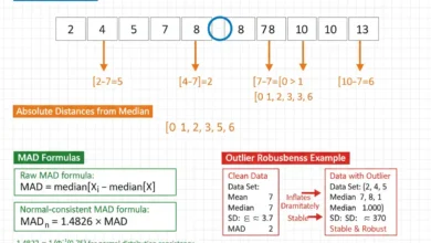
Because IQR is resistant to isolated extreme values, this rule can perform well for skewed or heavy-tailed data.
Once h has been chosen, a rough number of bins can be obtained from:
k ≈ Range/h.
This is still a heuristic rather than a guarantee of one objectively correct histogram.
Comparing Scott and Freedman–Diaconis
Scott’s rule uses:
standard deviation.
Freedman–Diaconis uses:
IQR.
If the distribution is approximately symmetric without influential extremes, both can produce sensible bin widths.
If extreme observations inflate standard deviation, Scott’s width can become relatively large and the graph can become oversmoothed.
Freedman–Diaconis is generally less sensitive to such extreme values because the central quartiles determine IQR.
The choice should reflect the data rather than being made mechanically.
Histogram and Distribution Shape
One of the primary purposes of a histogram is to reveal distribution shape.
A histogram can indicate whether data are:
- symmetric;
- right-skewed;
- left-skewed;
- unimodal;
- bimodal;
- multimodal;
- approximately uniform;
- concentrated around several clusters.
These features matter because two data sets can share the same mean and variance while having very different shapes.
A histogram preserves information that one-number summaries necessarily discard.
Symmetric Histogram
A symmetric histogram has roughly similar structure on both sides of a central location.
For example, frequencies might look like:
2, 6, 12, 18, 12, 6, 2.
The distribution rises toward a central peak and declines similarly on both sides.
In a sufficiently symmetric distribution, mean and median can be similar.
However, a symmetric histogram does not automatically imply that the population follows a normal distribution.
Many non-normal distributions are symmetric.
Bell-Shaped Histogram
A bell-shaped histogram is:
- approximately symmetric;
- concentrated around one central peak;
- progressively thinner toward both tails.
A normal population can generate this general appearance in sufficiently large samples, but a bell-shaped sample histogram is not proof of exact normality.
Likewise, a histogram that looks slightly irregular does not necessarily indicate a non-normal population, especially when sample size is small.
Sampling variability and bin choice affect the graph.
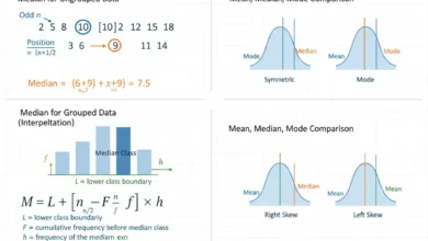
Right-Skewed Histogram
A right-skewed histogram has most observations concentrated toward lower or middle values, with a longer tail extending toward larger values.
Examples can arise with:
- income;
- transaction sizes;
- waiting times;
- claim amounts.
In many right-skewed distributions:
Mean > Median
because large upper-tail observations pull the arithmetic mean upward.
This relationship is common but should not be used as the definition of skewness.
The histogram displays the asymmetry more directly.
Left-Skewed Histogram
A left-skewed histogram has a longer tail toward smaller values.
Most observations occur toward the upper part of the measurement range.
Examples can occur when a measurement has an upper ceiling and most observations are near that maximum.
In many such cases:
Mean < Median.
Again, the relationship is descriptive rather than universal.
The distributional graph should guide interpretation.
Uniform Histogram
An approximately uniform histogram has similar heights across a broad range of bins.
For example:
10, 11, 9, 10, 10, 9, 11
shows little concentration around one preferred value.
This shape differs strongly from a bell-shaped distribution because observations are spread relatively evenly.
The arithmetic mean might still lie near the center, but it does not describe the lack of central concentration.
Bimodal Histogram
A bimodal histogram contains two prominent peaks.
For example, a distribution might show one cluster near:
20
and another near:
70
with fewer observations between them.
This can indicate:
- two subpopulations;
- two operating regimes;
- combined measurements from distinct sources.
An overall mean between the peaks may represent relatively few actual observations.
Recognizing bimodality can therefore materially change interpretation.
Multimodal Histogram
A histogram with several distinct peaks is multimodal.
Possible causes include:
- multiple subgroups;
- seasonal patterns;
- process changes;
- mixture distributions.
A multimodal graph should prompt investigation into whether the data should be stratified before being summarized with one central measure.
However, apparent small peaks can also arise from random noise or overly narrow bins.
The pattern should be checked across reasonable bin widths.
Histogram Gaps
A gap is an interval containing few or no observations between regions containing substantial data.
For example:
bins below 20 contain many observations,
20–40 contains none,
bins above 40 contain many observations.
This could indicate distinct groups.
It might also arise from:
- a measurement limit;
- missing data;
- selection rules;
- small sample randomness.
The histogram identifies the structure but does not determine its cause.
Histogram Clusters
A cluster is a region where observations are concentrated.
A distribution might contain a dense group between:
10 and 20
and another between:
80 and 90.
Clusters can represent meaningful subpopulations.
If those groups are combined, overall statistics such as the mean and standard deviation can hide their separate structures.
Visual inspection can therefore reveal when subgroup analysis may be more informative.
Histogram and Outliers
An isolated observation far from the main data can appear as:
- a single low-frequency outer bin;
- a separated bar;
- an extension of a long tail.
However, histogram visibility depends heavily on bin width.
A very wide bin can absorb an extreme observation into the main distribution and make it less obvious.
A very narrow bin can make ordinary tail observations appear unusually isolated.
Therefore, histograms are useful for detecting potential outliers but should not be the sole outlier criterion.
Histogram and Kurtosis
Kurtosis is a numerical characteristic related to the extremity of a distribution’s tails and the frequency of extreme deviations, whereas a histogram gives a direct graphical view of where observations are concentrated.
A histogram with many observations far into the tails may suggest heavy-tailed behavior, but kurtosis should not be interpreted simply as “how tall the center peak looks.” Different distributions can have similar central peaks while differing considerably in tail behavior.
The histogram provides visual evidence.
Kurtosis provides a numerical summary based on fourth-power deviations.
They should be interpreted together carefully when tail structure matters.
Histograms Do Not Prove Normality
A histogram can suggest whether normality is plausible, but it cannot prove that the data come from an exact normal population.
Several factors complicate visual judgment:
- sample size;
- bin width;
- bin starting point;
- random sampling variation.
A small normal sample can look highly irregular.
A non-normal sample can sometimes look approximately bell-shaped.
When distributional assumptions matter formally, additional diagnostic methods can supplement the histogram.
Histogram Bin Origin
Even if bin width remains fixed, shifting the starting boundary can change the visual appearance.
Suppose width is:
One histogram could use:
0–10, 10–20, 20–30
while another uses:
5–15, 15–25, 25–35.
The same observations can then be allocated differently.
A peak lying near a boundary in one version may fall near the center of a bin in another.
This is another reason not to overinterpret minor graphical features from one particular bin scheme.
Histogram vs Bar Chart
A histogram and a bar chart can look similar, but their statistical meanings differ.
A histogram represents:
numerical intervals.
A bar chart represents:
discrete categories.
Histogram bars usually touch because the intervals are adjacent on a continuous numerical scale.
Bar-chart bars are usually separated because category labels are distinct rather than neighboring portions of one measurement continuum.
Histogram order is determined by numerical position.
Bar-chart category order can often be rearranged without changing meaning.
Bar Width Meaning
In a histogram:
width = numerical interval size.
If one bar covers:
0–10
and another:
10–30,
the second bar represents twice as much horizontal numerical range.
In a categorical bar chart, visual width usually carries no quantitative meaning.
This distinction becomes especially important with unequal histogram classes because bar area, not merely height, must correspond correctly to frequency.
Histogram vs Frequency Polygon
A frequency polygon plots:
class midpoint
against:
frequency or relative frequency
and connects those points with line segments.
Histograms emphasize interval area.
Frequency polygons emphasize the rise and fall of frequency across class midpoints.
A polygon can be useful for overlaying several distributions because multiple lines are easier to compare than overlapping bars.
A histogram often provides a more intuitive picture of how much numerical range each class occupies.
Histogram vs Frequency Table
A table provides exact counts.
A histogram provides visual pattern.
Suppose a table states:
20–30 → 16 observations.
The number 16 can be read precisely.
In the histogram, that bar immediately appears taller than neighboring bars and reveals where the distribution peaks.
The strongest descriptive analysis often uses both forms when precision and visual structure are important.
Histogram vs Five-Number Summary
A five-number summary provides:
Minimum
Q₁
Median
Q₃
Maximum.
It is extremely compact but cannot reveal multiple peaks or internal gaps.
A histogram displays substantially more of the distribution’s internal structure.
For example, two data sets can have identical quartiles and endpoints yet one may be unimodal while the other is bimodal.
The histogram can reveal that distinction immediately.
Histogram vs Geometric Mean
The geometric mean summarizes positive multiplicative data through one central value.
A histogram shows the entire approximate distribution across intervals.
For a right-skewed positive variable, the geometric mean can provide an interpretable multiplicative center when the underlying process supports that interpretation, while the histogram reveals whether the sample is heavily skewed, contains several modes, or has a substantial lower or upper tail.
A central average should therefore not replace visual distribution inspection.
Histogram vs Harmonic Mean
The harmonic mean can be appropriate for reciprocal-rate problems, but it is highly sensitive to small positive observations.
A histogram of rate data can show whether such low values are:
- common;
- isolated;
- part of a separate group;
- suspicious measurement errors.
This context matters because one observation near zero can dramatically reduce a harmonic mean.
The graph therefore helps explain why a rate average takes the value it does.
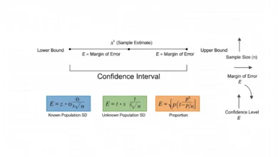
Histogram and Margin of Error
A histogram describes the observed distribution of individual data, while a margin of error describes inferential uncertainty around an estimated population quantity.
These concepts should not be confused.
A sample can have a very wide histogram because individual observations vary greatly while still having a relatively narrow confidence interval for the mean if n is very large.
Conversely, a narrow-looking distribution based on very few observations can produce substantial uncertainty about its population parameters.
Individual-data spread and estimator precision are different statistical quantities.
Histogram and Sample Size
Sample size strongly affects histogram appearance.
With:
n = 10,
a histogram can be extremely irregular because each observation represents 10% of the sample.
With:
n = 100,000,
the empirical distribution can appear much smoother.
However, large n does not guarantee that one particular bin width will reveal every important feature.
Too-wide bins can still hide genuine structure.
The choice of resolution remains important.
Small-Sample Histograms
For very small samples, histograms can be less informative because grouping already-limited observations into bins discards additional detail.
Suppose:
n = 8.
A histogram with six bins can contain mostly zeros and ones.
Displaying individual points, a dot plot, or the raw values can be more transparent.
A histogram becomes increasingly useful as the number of observations grows enough to support meaningful grouping.
Very Large Samples
Large samples can support narrower bins because more observations are available within each interval.
This can reveal:
- subtle skewness;
- small subgroups;
- shoulders;
- tail structure.
However, extremely narrow bins can still show visually distracting microstructure.
The objective is not to maximize the number of bars.
It is to select enough resolution to expose meaningful distributional patterns.
Histogram and Discrete Data
Histograms are most naturally associated with continuous or grouped numerical variables, but they can also be used for discrete numerical data.
For integer counts such as:
0, 1, 2, 3, …
bins can be centered around individual integers, for example:
−0.5 to 0.5
0.5 to 1.5
1.5 to 2.5.
This preserves numerical spacing while separating each integer outcome.
A bar chart can also be appropriate when the emphasis is on distinct discrete values rather than continuity.
Histogram and Categorical Data
A histogram should not ordinarily be used for nominal categories such as:
Red
Blue
Green.
These categories have no numerical interval widths.
A bar chart is more appropriate.
Assigning arbitrary numerical codes such as:
Red = 1
Blue = 2
Green = 3
does not turn the categories into a meaningful continuous scale.
Histogram intervals require quantitative ordering and numerical distance.
Unequal-Width Histogram Example
Suppose:
| Interval | Width | Frequency |
|---|---|---|
| 0–10 | 10 | 10 |
| 10–30 | 20 | 20 |
| 30–40 | 10 | 15 |
Calculate density.
For 0–10:
d₁ = 10/10
= 1
For 10–30:
d₂ = 20/20
= 1
For 30–40:
d₃ = 15/10
= 1.5
Therefore, the histogram heights should be:
1, 1, 1.5
rather than:
10, 20, 15.
Check the Areas
First bar:
Area = 10 × 1
= 10
Second:
Area = 20 × 1
= 20
Third:
Area = 10 × 1.5
= 15
These areas exactly reproduce the frequencies:
10, 20, 15.
The second bar is twice as wide as the first and has equal height, so it has twice the area and correctly represents twice as many observations.
This is the correct visual encoding for unequal-width bins.
Relative Frequency Density
A histogram can instead be normalized so that total area equals one.
Define:
Relative density = fᵢ/(n wᵢ)
Suppose:
n = 45.
For the 10–30 interval:
f = 20
w = 20
so:
Relative density = 20/(45 × 20)
= 1/45
≈ 0.02222.
The bar area is:
20 × 0.02222
≈ 0.4444
which equals:
20/45.
Thus, each bar’s area represents relative frequency.
Total Area of a Density Histogram
If each bar height is:
fᵢ/(nwᵢ),
then total area is:
Σ[wᵢ × fᵢ/(nwᵢ)]
= Σ(fᵢ/n)
= (1/n)Σfᵢ
= n/n
= 1.
Therefore:
Total histogram area = 1.
This makes a normalized histogram analogous to a probability density representation.
Probabilities are represented by area rather than by height alone.
Probability From Histogram Area
Suppose a density histogram has a bar covering:
10 ≤ x < 20
with height:
0.03.
The width is:
Therefore, its relative-frequency area is:
10 × 0.03
= 0.30.
Thus approximately:
30%
of observations fall in that interval.
This demonstrates why density height should not itself be interpreted as probability.
Probability corresponds to area over an interval.
Histogram and Probability Density Functions
A sample density histogram is discrete in its bins, while a theoretical probability density function is usually represented by a smooth curve.
As sample size grows and bin width is chosen appropriately, the histogram can approximate the shape of an underlying continuous density.
However, a histogram remains a data summary.
A theoretical density is a mathematical probability model.
Agreement in visual shape can support model plausibility but does not prove the model is correct.
Changing Bin Width
Suppose a distribution contains two nearby peaks.
With narrow bins, both may be visible.
With much wider bins, the peaks can merge into one broad bar region.
Conversely, extremely narrow bins can break one genuine smooth peak into many small local irregularities.
The histogram therefore contains a resolution parameter.
Changing bin width is somewhat analogous to changing magnification: different levels reveal different structures.
Changing Bin Boundaries
Bin width is not the only choice that matters.
Suppose values cluster around:
10, 20, 30.
Bins beginning at:
0
may group them differently from bins beginning at:
A visually important feature can move from the center of a bin to its boundary.
For serious distribution assessment, viewing several reasonable origins can help determine whether an apparent gap or peak is stable or merely a grouping artifact.
Detecting Data-Entry Problems
Histograms can reveal suspicious measurement patterns.
For example:
- one isolated bar far from all other observations;
- unexpected spikes at round numbers;
- gaps where observations should be possible;
- a pile-up at a measurement limit.
Such patterns can indicate:
- data-entry errors;
- instrument rounding;
- censoring;
- coding problems.
The graph does not prove an error exists, but it can direct quality-control investigation efficiently.
Heaping
Heaping occurs when observations disproportionately accumulate at certain convenient values.
For example, self-reported ages might cluster at:
30, 35, 40, 45
more strongly than neighboring ages.
A narrow-bin histogram can expose these spikes.
Heaping may reflect rounding or reporting behavior rather than the natural continuous distribution of the variable.
Recognizing it can be important before fitting probability models.
Truncation
A truncated distribution excludes observations beyond a specified boundary.
Suppose values below:
0
cannot enter the sample because of a selection rule.
The histogram may show an abrupt edge at zero.
This differs from an ordinary naturally thinning tail.
Recognizing truncation matters because standard distributional models can be misleading if the sampling process has deliberately removed part of the population range.
Censoring
Censoring occurs when observations beyond a threshold are not recorded exactly.
For example, a measurement system might report every value above:
100
as:
“100+”.
A histogram can show an unusual accumulation at the censoring boundary.
That bar does not mean every observation truly equals 100.
It represents incomplete information about the upper tail.
Ordinary histogram interpretation should therefore incorporate how measurements were recorded.
Transforming Data Before Plotting
A strongly right-skewed positive variable can sometimes be easier to examine after a logarithmic transformation:
Y = ln(X).
The resulting histogram may spread small values and compress extremely large ones.
This can reveal multiplicative structure that is difficult to see on the original scale.
However, the graph then represents:
ln(X)
rather than X.
Axes and interpretations should clearly indicate the transformation.
Logarithmic Axis vs Log-Transformed Histogram
Two approaches should be distinguished.
One approach transforms observations:
y = ln(x)
and constructs equal-width bins on the log scale.
Another displays original-scale bins on a logarithmic axis.
These are not necessarily identical representations.
The binning operation and transformation order matter.
When multiplicative comparisons are central, explicitly analyzing the log-transformed observations can often provide clearer statistical interpretation.
Comparing Histograms
Histograms can compare distributions, but direct overlay requires care.
Two samples may differ in:
- n;
- bin boundaries;
- bin widths;
- axis scales.
Comparisons are clearest when the histograms use:
- common boundaries;
- common widths;
- common horizontal scale;
- relative frequency or density when sample sizes differ.
Otherwise, apparent differences can be caused by presentation rather than the data.
Different Sample Sizes
Suppose:
Sample A has n = 100
and:
Sample B has n = 10,000.
A raw-frequency histogram for B will naturally have much taller bars.
That does not necessarily mean its distribution is more concentrated.
Using:
relative frequency
or:
density
puts the samples on comparable scales.
The goal is to compare distribution shape rather than raw sample counts.
Histograms and Statistical Inference
A histogram is primarily descriptive.
It can suggest:
- skewness;
- subgroup structure;
- unusual values;
- distributional assumptions worth questioning.
It does not by itself determine statistical significance.
Two sample histograms can appear different while the difference is compatible with sampling variation.
Conversely, very similar-looking histograms from huge samples can correspond to statistically detectable differences in population parameters.
Inference requires procedures designed to quantify uncertainty.
Common Histogram Mistakes
A common mistake is treating a histogram as though it were a categorical bar chart, including rearranging bins into an arbitrary order. Numerical intervals must remain in their correct quantitative positions.
Another error is leaving gaps between ordinary adjacent histogram bars in a way that suggests the intervals are unrelated categories.
A more serious mathematical mistake is using raw frequency as bar height when bin widths differ. In that situation, frequency density should normally determine height so that bar area represents frequency.
Analysts may also use overlapping class definitions, causing boundary observations to be counted twice, or leave gaps that exclude valid values.
Another mistake is interpreting the tallest bar as automatically containing the mean or median. The modal class identifies the greatest local frequency but need not contain either arithmetic center.
Using one arbitrary bin width and treating every apparent peak or gap as a permanent feature is also risky.
Finally, a histogram should not be presented as proof of a theoretical distribution, statistical significance, or causation.
How to Make a Histogram Step by Step
Begin with numerical observations and identify their minimum, maximum, sample size, and broad distributional range.
Choose sensible bin boundaries that:
- cover all observations;
- do not overlap;
- have a clear inclusion convention.
Count the observations in each bin:
fᵢ.
Verify:
Σfᵢ = n.
If every bin has equal width, plot frequency or relative frequency as bar height.
If widths differ, calculate:
dᵢ = fᵢ/wᵢ
and use frequency density so bar area remains proportional to count.
Label both axes clearly, inspect the resulting distribution, and compare alternative reasonable bin widths if important visual conclusions depend on the first grouping.
Full Histogram Worked Example
Consider the raw data:
4, 7, 9, 12, 14, 15, 16, 18, 21, 22, 22, 24, 25, 27, 28, 31, 32, 35, 36, 42
There are:
n = 20
observations.
Use classes:
0 ≤ x < 10
10 ≤ x < 20
20 ≤ x < 30
30 ≤ x < 40
40 ≤ x < 50
Count each class.
0–10
Values:
4, 7, 9
Therefore:
f₁ = 3
10–20
Values:
12, 14, 15, 16, 18
Therefore:
f₂ = 5
20–30
Values:
21, 22, 22, 24, 25, 27, 28
Therefore:
f₃ = 7
30–40
Values:
31, 32, 35, 36
Therefore:
f₄ = 4
40–50
Value:
42
Therefore:
f₅ = 1
Build the Table
The frequency distribution is:
| Interval | Frequency | Relative Frequency |
|---|---|---|
| 0–10 | 3 | 0.15 |
| 10–20 | 5 | 0.25 |
| 20–30 | 7 | 0.35 |
| 30–40 | 4 | 0.20 |
| 40–50 | 1 | 0.05 |
Check:
3 + 5 + 7 + 4 + 1 = 20
and:
0.15 + 0.25 + 0.35 + 0.20 + 0.05 = 1.00.
Because every bin has width:
10,
the frequency bar heights can be:
3, 5, 7, 4, 1.
Interpret the Worked Histogram
The greatest concentration occurs in:
20–30
with:
7 observations
or:
35%
of the sample.
The neighboring:
10–20
and:
30–40
classes also contain substantial observations, so most of the sample lies between 10 and 40.
Only:
1 observation
lies between 40 and 50.
The graph would therefore rise toward the 20–30 interval and fall afterward, producing a single broad central concentration with relatively little upper-tail mass.
Rebuild With Wider Bins
Now combine classes into:
0–20
20–40
40–60.
The frequencies become:
8, 11, 1.
This version is simpler but hides much of the internal structure.
For example, the distinction between:
20–30
and:
30–40
disappears.
The example demonstrates how wider bins create smoother, more compressed views at the expense of detail.
Rebuild With Narrower Bins
Using width:
5
would produce more bars, such as:
0–5
5–10
10–15
and so forth.
This would reveal more local structure, including repeated values such as:
However, with only 20 observations, many five-unit bins may have very small frequencies.
The graph could therefore become visually noisy.
Bin selection is a balance between resolution and stability.
Full Unequal-Bin Example
Suppose observations are summarized as:
| Interval | Frequency |
|---|---|
| 0–5 | 6 |
| 5–15 | 18 |
| 15–20 | 14 |
| 20–40 | 12 |
Widths are:
5, 10, 5, 20.
Calculate densities:
For 0–5:
6/5 = 1.2
For 5–15:
18/10 = 1.8
For 15–20:
14/5 = 2.8
For 20–40:
12/20 = 0.6
The histogram heights should therefore be:
1.2, 1.8, 2.8, 0.6.
Verify the Unequal-Bin Areas
For 0–5:
Area = 5(1.2) = 6
For 5–15:
Area = 10(1.8) = 18
For 15–20:
Area = 5(2.8) = 14
For 20–40:
Area = 20(0.6) = 12
Each area reproduces the corresponding frequency exactly.
The:
15–20
interval therefore has the greatest concentration even though the:
5–15
interval contains the largest raw number of observations.
How to Report a Histogram
A useful interpretation describes the main distributional features rather than simply restating every bar height.
For example:
“The histogram was unimodal, with the highest frequency in the 20–30 interval. Most observations fell between 10 and 40, frequencies declined toward both ends of the observed range, and only a small proportion occupied the uppermost interval.”
If bins have unequal widths, state that the vertical axis represents:
frequency density
rather than ordinary count.
When a pattern such as skewness or bimodality is sensitive to bin choice, acknowledge that rather than presenting it as an unquestionable characteristic.
Frequently Asked Questions About Histograms
What is a histogram?
A histogram is a graph that shows the distribution of numerical observations across adjacent intervals or bins.
What does the x-axis show?
Numerical values or class intervals.
What does the y-axis show?
It can show frequency, relative frequency, percentage, or frequency density.
What is a histogram bin?
A bin is a numerical interval used to group observations.
What is histogram frequency?
It is the number of observations falling within a bin.
What is the basic frequency formula?
fᵢ = Number of observations in bin i
What should all histogram frequencies sum to?
Σfᵢ = n
What is relative frequency?
rᵢ = fᵢ/n
What is class width?
Width = Upper boundary − Lower boundary
What is frequency density?
Frequency density = Frequency / Class width
When is frequency density necessary?
It is especially important when histogram bins have unequal widths.
Why?
Because bar area, rather than height alone, should represent frequency.
What is the area of a frequency-density bar?
Area = Width × Density = Frequency
Can frequency be used as height with equal-width bins?
Yes.
What is relative frequency density?
fᵢ/(n wᵢ)
What does the total area of a normalized density histogram equal?
1
Why do histogram bars usually touch?
Because neighboring bars represent adjacent intervals on a numerical continuum.
How is a histogram different from a bar chart?
A histogram represents numerical intervals whose widths and order have quantitative meaning. A bar chart represents separate categories.
Can histogram bars be rearranged?
No. Their positions follow the numerical scale.
Can bar-chart categories be rearranged?
Often yes, unless their order has substantive meaning.
What is the modal class?
The interval with the greatest frequency, or greatest density when unequal widths require density-based interpretation.
Can a histogram have two peaks?
Yes. Such a graph can be described as bimodal.
What does bimodality suggest?
It can indicate two subgroups or processes, although binning and sampling noise should also be considered.
What is a multimodal histogram?
It has several prominent peaks.
What does a right-skewed histogram look like?
It has a longer tail extending toward larger values.
What does a left-skewed histogram look like?
It has a longer tail toward smaller values.
What is a symmetric histogram?
Its distributional structure is approximately balanced around a central location.
Does a symmetric histogram prove normality?
No.
Does a bell-shaped histogram prove a normal population?
No.
Can normally distributed data produce an irregular histogram?
Yes, especially in smaller samples.
Can bin width change the histogram shape?
Yes, sometimes dramatically.
Can changing the first bin boundary change the appearance?
Yes.
Is there one correct number of bins?
No.
What is the square-root rule?
k ≈ √n
What is Sturges’ rule?
k ≈ 1 + log₂(n)
What is Scott’s bin-width rule?
h = 3.5s/n^(1/3)
What is the Freedman–Diaconis rule?
h = 2(IQR)/n^(1/3)
Which bin-width rule is best?
No rule is universally best. Distribution shape, sample size, outliers, and analytical purpose matter.
Why can Freedman–Diaconis be resistant to outliers?
Because it uses IQR instead of standard deviation.
Can a histogram identify outliers?
It can suggest isolated extreme observations or sparse tail regions, but the result depends on bin width and should not be used as the only outlier criterion.
Can a histogram reveal gaps?
Yes.
Can it reveal clusters?
Yes.
Can it reveal multimodality?
Often, provided bin choices preserve the relevant structure.
Can a histogram be used for categorical data?
Not ordinarily. A bar chart is more appropriate for nominal categories.
Can a histogram be used for discrete numerical data?
Yes, with suitable numerical bins.
Is a histogram a probability distribution?
A histogram summarizes observed data. A normalized density histogram can approximate an underlying probability density but is not itself proof of a theoretical distribution.
What does density histogram area represent?
Relative frequency or empirical probability over the corresponding interval.
Is density height itself a probability?
No. Probability corresponds to area over an interval.
Does a histogram show the mean?
Not directly.
Does it show the median?
Not directly, although their approximate locations may sometimes be inferred from the distribution.
Does it show standard deviation?
No. Spread can be seen visually, but standard deviation is a separate numerical calculation.
How does sample size affect a histogram?
Larger samples generally produce more stable distributional patterns and can support finer binning.
Are histograms useful for very small samples?
They can be, but dot plots or individual observations may preserve more information when n is very small.
Can two histograms with different sample sizes be compared?
Yes, but relative frequency or density is generally more appropriate than raw frequency.
What is the main advantage of a histogram?
It reveals distribution shape, concentration, spread, tails, gaps, and modes that one-number statistics can hide.
What is its main limitation?
Its appearance depends on bin width and boundaries, and it compresses the exact locations of observations within each interval.
What is the most important rule when creating a histogram?
Use mutually exclusive numerical bins, count every observation exactly once, preserve the numerical order of the horizontal axis, and use frequency density rather than raw height whenever unequal bin widths require bar area to represent frequency correctly.