Descriptive Statistics: Complete Guide, Formulas & Examples

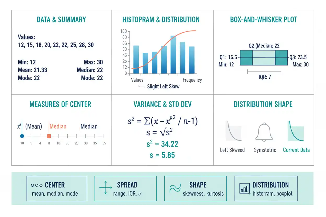
Descriptive statistics are methods used to organize, summarize, and present observed data so that its main characteristics can be understood without inspecting every individual value. They answer practical questions about where a data set is centered, how widely its observations are spread, which values occur most often, how the distribution is shaped, where observations fall within that distribution, and whether unusual patterns deserve closer attention. Common descriptive statistics include the arithmetic mean, median, mode, minimum, maximum, range, variance, standard deviation, quartiles, interquartile range, proportions, frequencies, and relative frequencies, while graphical methods such as histograms, box plots, frequency distributions, and scatter plots make the same information easier to examine visually. These methods can describe a complete population or an observed sample, but descriptive statistics alone do not automatically generalize sample findings to a larger population because such generalization requires an inferential framework. Their purpose is therefore not to prove hypotheses or establish causation but to turn raw observations into meaningful summaries that preserve the most important information about center, variability, distribution, and relationships.
Within Statistics & Probability, descriptive statistics provide the first structured layer of analysis before confidence intervals, hypothesis tests, regression inference, or probability-based conclusions are considered. A careful descriptive analysis often reveals skewness, unusual values, subgroup differences, measurement problems, or nonlinearity that would otherwise remain hidden behind a single average, making it an essential step even when more advanced statistical methods will eventually follow.
What Are Descriptive Statistics?
Descriptive statistics are numerical and graphical techniques that describe the data currently available.
Suppose a data set contains:
4, 6, 7, 8, 10, 12, 13, 20
Instead of reporting all eight observations repeatedly, descriptive statistics can summarize the set through quantities such as:
Sample size = 8
Mean = 10
Median = 9
Minimum = 4
Maximum = 20
Range = 16
These summaries provide a compact description of the observed values.
However, each statistic preserves only part of the original information. The mean describes arithmetic center, the median describes central rank, and the range describes total observed span, while none of them alone reveals the complete distribution.
For that reason, descriptive analysis usually combines several numerical measures with graphical examination.
What Do Descriptive Statistics Describe?
Most descriptive statistics answer one of several broad questions.
They describe:
- amount or frequency — how often values or categories occur;
- center — where a numerical distribution is located;
- spread — how dispersed observations are;
- position — where particular values fall within an ordered distribution;
- shape — whether a distribution is symmetric, skewed, multimodal, or heavy-tailed;
- relationship — how two or more variables move together descriptively.
A useful descriptive report usually does not maximize the number of statistics shown. Instead, it selects the summaries that best explain the important structure in the data.
Descriptive Statistics vs Inferential Statistics
Descriptive statistics summarize observed data.
Inferential statistics use sample data and probability models to make statements about a wider population or data-generating process.
Suppose 100 sampled observations have:
Mean = 72
A descriptive statement is:
“The observed sample mean was 72.”
An inferential question is:
“What does this sample tell us about the unknown population mean?”
Answering the second question requires information about sampling variability, standard errors, assumptions, and an inferential procedure.
The distinction is fundamental because a sample summary remains a fact about the observed sample even when the sample is biased or unrepresentative, while a population conclusion can become invalid when the sampling process does not support generalization.
Population and Sample
A population is the complete collection of units or outcomes relevant to a question.
A sample is a subset of those units.
Population size is often written:
N
while sample size is written:
n.
If all 2,000 items in a finite production batch are measured, descriptive quantities calculated from those observations describe that complete batch.
If only:
n = 100
items are measured, the resulting numerical summaries describe those 100 observations directly and can potentially estimate population characteristics only through an appropriate inferential design.
Descriptive statistics themselves remain useful in both settings.
Types of Descriptive Statistics
Descriptive statistics can be organized into several broad groups:
- measures of frequency;
- measures of central tendency;
- measures of dispersion;
- measures of position;
- measures of distribution shape;
- graphical summaries;
- descriptive measures of association.
These categories overlap because a complete understanding of a data set often requires several of them together.
For example, a mean without a measure of spread can conceal substantial variability, while a standard deviation without a measure of center can be difficult to interpret.
Frequency
Frequency is the number of times a value or category occurs.
Suppose the observed categories are:
A, B, B, C, B, A, C, B
Then:
Frequency of A = 2
Frequency of B = 4
Frequency of C = 2
Total frequency is:
n = 8
Frequency counts are especially useful for categorical and discrete data because they show how observations are distributed among the possible values.
Relative Frequency
Relative frequency divides a category’s frequency by the total number of observations:
Relative frequency = Frequency / n
For category B:
Relative frequency = 4/8
= 0.50
or:
50%
Relative frequencies allow groups of different sizes to be compared more meaningfully than raw counts alone.
For example, 50 cases can represent a very large proportion of a group containing 60 observations but a tiny proportion of one containing 100,000.
Cumulative Frequency
Cumulative frequency shows how many observations occur at or below successive ordered values or class boundaries.
Suppose ordered values have frequencies:
| Value | Frequency |
|---|---|
| 1 | 3 |
| 2 | 5 |
| 3 | 4 |
| 4 | 2 |
The cumulative frequencies are:
| Value | Cumulative Frequency |
|---|---|
| 1 | 3 |
| 2 | 8 |
| 3 | 12 |
| 4 | 14 |
The final cumulative frequency equals total sample size:
n = 14
This structure is useful for understanding ranks, percentiles, medians, and the accumulation of observations across an ordered distribution. The dedicated cumulative frequency guide covers its calculation and interpretation in greater detail.
Frequency Distribution
A frequency distribution organizes observations according to values or intervals and reports how often each occurs.
For discrete data, individual values can be listed directly.
For continuous data, observations are often grouped into intervals such as:
0–10
10–20
20–30
The interval widths, boundaries, and number of classes influence how clearly the distribution is represented.
Too many intervals can make random detail dominate the display, while too few can conceal important structure.
Frequency distributions therefore combine calculation with sensible grouping decisions.
Central Tendency
Measures of central tendency identify values that represent the center of a distribution.
The three most familiar are:
Mean
Median
Mode
They are not interchangeable.
The arithmetic mean is determined by every numerical value, the median depends primarily on rank, and the mode identifies the most frequent value or category.
The best choice depends on the data type, distribution shape, and interpretation needed.
Arithmetic Mean
The sample arithmetic mean is:
x̄ = Σxᵢ/n
For:
5, 7, 8, 10, 15
we have:
x̄ = (5 + 7 + 8 + 10 + 15)/5
x̄ = 45/5
x̄ = 9
The mean uses every numerical observation, which gives it desirable mathematical properties but also makes it sensitive to extreme values.
For a deeper treatment of the calculation, weighted cases, transformation rules, and interpretation, see arithmetic mean.
Population Mean
For a finite population:
μ = Σxᵢ/N
The distinction between:
μ
and:
x̄
reflects statistical role.
μ describes the complete population mean.
x̄ describes a sample mean and can serve as an estimator of μ when sampling assumptions support that interpretation.
The underlying arithmetic is similar, but the inferential meaning is different.
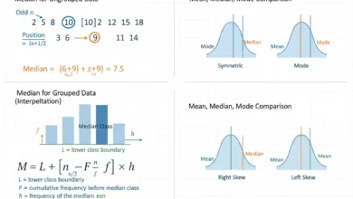
Median
The median is the middle ordered value.
For an odd-sized data set:
2, 5, 8, 12, 20
the median is:
8
because it occupies the middle position.
For an even-sized set:
2, 5, 8, 12
the conventional median is:
(5 + 8)/2
= 6.5
The median is resistant to isolated extreme magnitudes because changing a maximum from 20 to 20,000 does not necessarily change the middle ranked position.
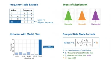
Mode
The mode is the most frequent value or category.
For:
1, 2, 2, 3, 3, 3, 4
the mode is:
3
A data set can have more than one mode when several values share the highest frequency.
The mode is particularly useful for nominal categorical data because concepts such as an arithmetic mean may have no meaningful interpretation for unordered labels.
Mean, Median, and Mode Together
Comparing several center measures can provide clues about distribution structure.
Consider:
5, 6, 7, 8, 40
The mean is:
13.2
while the median is:
7
The large upper value pulls the arithmetic mean strongly upward.
This gap suggests a distribution with substantial upper-tail influence.
However, the relationship among mean, median, and mode should not be treated as an infallible rule for determining skewness. Graphical inspection provides a more complete view.
Measures of Dispersion
Center does not tell us how widely observations are spread.
Consider:
A: 48, 49, 50, 51, 52
and:
B: 10, 30, 50, 70, 90
Both have mean:
50
but B is much more dispersed.
Measures of dispersion quantify this difference.
Common measures include:
Range
Variance
Standard deviation
Interquartile range
Coefficient of variation
Each emphasizes a different aspect of spread.
Range
The range is:
Range = Maximum − Minimum
For:
4, 7, 10, 12, 20
we obtain:
Range = 20 − 4
= 16
The range is simple and communicates the total observed span.
However, it depends only on two observations—the minimum and maximum—and can therefore change dramatically because of one extreme value.
It also generally increases as larger samples provide more opportunities to observe extreme values.
Variance
Population variance is:
σ² = Σ(xᵢ − μ)²/N
while the conventional sample variance estimator is:
s² = Σ(xᵢ − x̄)²/(n − 1)
Variance measures dispersion through squared deviations from the arithmetic mean.
Because deviations are squared, large departures from the mean receive substantial weight.
Variance is mathematically important, but its squared units can make direct interpretation less intuitive than standard deviation.
Standard Deviation
Standard deviation is the square root of variance.
For a population:
σ = √σ²
For a sample:
s = √s²
If a variable is measured in centimeters, standard deviation is also measured in centimeters.
That makes it easier to interpret than variance, which would be expressed in centimeters squared.
Standard deviation is widely used when mean-based summaries are appropriate, although its sensitivity to extreme values should be considered.
Interquartile Range
The interquartile range is:
IQR = Q₃ − Q₁
It describes the width of the middle 50% of an ordered distribution.
Because it depends on central rank positions rather than extreme minimum and maximum values, IQR is substantially more resistant to isolated extreme observations than the ordinary range.
This makes it especially useful alongside the median for skewed or heavy-tailed data.
Coefficient of Variation
The coefficient of variation expresses standard deviation relative to the mean.
A common sample form is:
CV = s/x̄
and as a percentage:
CV% = 100(s/x̄)
Suppose:
x̄ = 100
and:
s = 20
Then:
CV = 20/100
= 0.20
or:
20%
Because the measure is relative, it can help compare dispersion across suitable positive ratio-scale variables with different mean levels. Its interpretation and limitations are covered in the specialist coefficient of variation guide.
Why Relative Variability Can Matter
Consider two processes:
Process A: Mean = 10, SD = 2
Process B: Mean = 1,000, SD = 50
Process B has a much larger raw standard deviation:
50 vs 2
but relative to its mean:
CV_A = 2/10 = 20%
while:
CV_B = 50/1000 = 5%
Thus Process A has greater variability relative to its typical magnitude.
Direct standard-deviation comparisons and relative-variation comparisons answer different questions.
Measures of Position
Measures of position describe where observations lie within an ordered distribution.
Common positional summaries include:
Quartiles
Percentiles
Deciles
These measures depend primarily on rank rather than raw arithmetic distance.
For example:
Q₂
is the median, corresponding conceptually to the 50th percentile.
Positional statistics can be particularly informative when the distribution is skewed or when users need thresholds such as the 25th, 75th, or 90th percentile.
Quartiles
Quartiles divide an ordered distribution into four broad sections.
The three main quartiles are:
Q₁ ≈ 25th percentile
Q₂ = median ≈ 50th percentile
Q₃ ≈ 75th percentile
The exact finite-sample calculation of Q₁ and Q₃ can differ across statistical conventions and software.
Consequently, two valid methods can occasionally produce slightly different quartiles for the same small data set.
The method should be stated when exact reproducibility matters.
Five-Number Summary
A five-number summary consists of:
Minimum
Q₁
Median
Q₃
Maximum
Suppose a data set has:
Minimum = 4
Q₁ = 7
Median = 10
Q₃ = 15
Maximum = 30
These values provide a compact overview of the distribution’s center, central spread, and overall span.
They also provide the structural basis for one of the most common graphical summaries of numerical data: the box plot.
Box Plot
A box plot visualizes ordered distribution summaries using a box that typically extends from:
Q₁ to Q₃
with a line marking the median.
Its central box therefore represents:
IQR = Q₃ − Q₁
Whiskers extend outward according to a specified convention, often using observations within 1.5×IQR fences, while more distant observations may be plotted separately.
A box plot provides a compact way to compare center, spread, asymmetry, and potential extreme values across groups. The detailed construction and interpretation rules are covered in the box plot guide.
Distribution Shape
Two data sets can share the same mean and standard deviation while having very different shapes.
A distribution can be:
- symmetric,
- right-skewed,
- left-skewed,
- unimodal,
- bimodal,
- multimodal,
- heavy-tailed.
Descriptive analysis therefore should not stop after calculating center and spread.
Graphs and positional summaries can reveal important structural features that a small group of numerical statistics cannot preserve.
Symmetric Distributions
A symmetric distribution has approximately mirrored structure around its center.
If an exactly symmetric distribution has a unique central location, its mean and median can coincide.
However, symmetry does not imply low variability.
A wide symmetric distribution can have a large standard deviation, while a tightly concentrated symmetric distribution can have a small one.
Shape and spread describe different characteristics.
Right Skew
A right-skewed distribution has a longer or heavier upper tail.
Examples can arise when most observations are moderate but a smaller number are extremely large.
In many right-skewed distributions:
Mean > Median
because large upper observations pull the arithmetic mean upward.
This relationship is common but should not be used as the sole definition of skewness.
A histogram, box plot, or other distributional display can reveal the asymmetry more directly.
Left Skew
A left-skewed distribution has a longer or heavier lower tail.
In many such distributions:
Mean < Median
because unusually low values pull the arithmetic mean downward.
Again, this is a useful descriptive tendency rather than a universal algebraic rule.
The full distribution should be examined before drawing conclusions about shape.
Modality
A mode is a concentration or peak in a distribution.
A unimodal distribution has one principal peak.
A bimodal distribution has two.
Multiple modes can suggest distinct subgroups.
For example, combining observations from two populations with different centers can create a bimodal distribution even when each subgroup is individually narrow and approximately symmetric.
Reporting only the overall mean in such a case can conceal meaningful population structure.
Outliers
An outlier is an observation that is unusually distant from the main body of the data under a chosen statistical or contextual criterion.
Potential causes include:
- genuine rare values,
- measurement errors,
- recording errors,
- subgroup membership,
- process changes.
An extreme observation should not automatically be removed.
Instead, its origin and influence should be investigated.
Descriptive statistics are particularly useful here because comparing robust and non-robust summaries can reveal how strongly unusual observations influence the apparent center and spread.
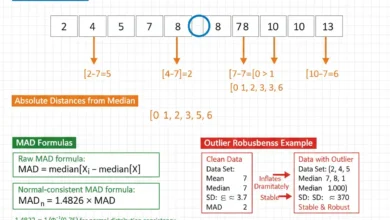
Robust vs Non-Robust Statistics
A robust statistic is relatively resistant to a limited number of extreme observations.
Examples include:
Median
IQR
Mean and standard deviation are much less robust because every value contributes directly and large deviations can receive substantial weight.
Consider:
10, 11, 12, 13, 14
If 14 becomes:
1,000
the mean and standard deviation change dramatically.
The median changes little or not at all.
Using both kinds of measures can therefore reveal whether the distribution contains substantial tail influence.
Categorical Descriptive Statistics
For categorical variables, useful descriptive statistics include:
Frequency
Relative frequency
Proportion
Percentage
Mode
Suppose 200 observations are classified as:
A = 90
B = 70
C = 40
Then:
Proportion A = 90/200 = 0.45
Proportion B = 70/200 = 0.35
Proportion C = 40/200 = 0.20
These summaries describe the category distribution without inventing numerical operations that have no substantive meaning.
For unordered categories, calculating an arithmetic mean of arbitrary category codes would generally be inappropriate.
Numerical Descriptive Statistics
For numerical data, descriptive analysis can include:
- mean,
- median,
- minimum and maximum,
- variance,
- standard deviation,
- quartiles,
- IQR,
- percentiles.
The best combination depends on distribution shape.
For approximately symmetric data without major extremes:
Mean + standard deviation
can provide a useful summary.
For strongly skewed data:
Median + IQR
can often better represent the central distribution.
Graphical examination should guide this choice rather than assuming one summary convention fits every numerical variable.
Discrete Data
Discrete numerical variables take countable values.
Examples include:
number of purchases,
number of errors,
number of calls.
Frequency tables are particularly informative for discrete data because exact counts for each possible value can often be displayed directly.
Means and variances can also be useful when they have a clear interpretation.
The appropriate graphical representation may include a frequency bar chart rather than treating every count as part of an uninterrupted continuous scale.
Continuous Data
Continuous variables can conceptually take any value within intervals.
Examples include:
height,
duration,
mass,
temperature.
Because many unique values may occur, grouping observations into intervals can make the distribution easier to summarize visually.
Histograms are commonly used for this purpose.
Choice of interval width matters because it influences how much detail is visible.
Histogram
A histogram groups numerical values into bins and displays the number or density of observations in each interval.
Histograms help identify:
- skewness,
- concentration,
- gaps,
- multiple modes,
- tail behavior,
- unusual observations.
A mean and standard deviation cannot reveal whether a distribution is unimodal or bimodal, but a histogram often can.
However, the visual impression can change with bin width, so several reasonable bin choices may be worth examining when distribution shape is important.
Bar Chart vs Histogram
A bar chart is generally used for categories, while a histogram represents intervals of a numerical variable.
Bar-chart categories are discrete labels and can have spaces between their visual bars.
Histogram bars represent neighboring numerical intervals and ordinarily touch because the underlying measurement scale is continuous across their boundaries.
Confusing these graph types can obscure whether the horizontal axis represents categories or a quantitative continuum.
Scatter Plot
A scatter plot displays paired numerical observations:
(xᵢ, yᵢ)
and is useful for descriptive examination of relationships.
It can show:
- positive association,
- negative association,
- curvature,
- clusters,
- changing spread,
- unusual points.
Before fitting a statistical relationship, a scatter plot can reveal whether a simple linear description is plausible.
A numerical correlation alone cannot show all these features.
Descriptive Association
Descriptive statistics can summarize how variables vary together.
Common examples include:
Covariance
Correlation
A positive correlation indicates that larger values of one variable tend to occur with larger values of another in a linear sense, while a negative value indicates an inverse linear association.
However, association does not establish causation.
A descriptive relationship can arise because of confounding, selection, shared trends, or other mechanisms.
The descriptive statistic answers what the observed data look like, not why the relationship exists.
Weighted Mean
When observations represent different amounts or importance, a weighted mean may be appropriate:
x̄w = Σwᵢxᵢ / Σwᵢ
Suppose values are:
80, 90
with weights:
1, 3.
Then:
x̄w = [1(80) + 3(90)]/(1 + 3)
= 350/4
= 87.5
The ordinary unweighted mean would be:
85
which gives both observations equal influence.
Weighted summaries should be used only when the weights have a clear statistical or substantive meaning.
Geometric Mean
For positive values:
x₁, x₂, …, xₙ
the geometric mean is:
GM = (x₁x₂…xₙ)^(1/n)
It is especially relevant when changes compound multiplicatively, such as growth factors.
The geometric mean is not simply an alternative used whenever the arithmetic mean seems inconvenient.
It answers a different mathematical question.
For ordinary additive quantities, the arithmetic mean usually remains the natural average.
Descriptive Percentages
Percentages make proportions easier to communicate.
If:
18
of:
60
observations meet a condition:
Proportion = 18/60
= 0.30
and:
Percentage = 30%
When comparing groups of different sizes, percentages often reveal relative frequency more clearly than raw counts.
However, percentages should usually be reported with their denominators because:
50%
could mean:
1 of 2
or:
50,000 of 100,000.
The statistical reliability and practical meaning differ substantially.
Rate
A rate describes occurrence relative to exposure, time, population size, or another denominator.
For example:
Rate = Events / Person-time
or:
Defect rate = Defects / Units inspected
Rates differ from simple percentages because the denominator can represent exposure rather than merely the count of individual observations.
A clear descriptive report should identify the denominator explicitly.
Otherwise, numerical comparisons can become misleading.
Index Numbers
Some descriptive analyses transform values relative to a reference level.
A basic index can be written:
Index = Current value / Base value × 100
If:
Base = 80
and:
Current = 100
then:
Index = 100/80 × 100
= 125
The indexed value indicates the current level is 25% above the base.
Such transformations can make comparisons easier across time or categories, but they preserve only selected information about the original measurements.
Data Cleaning Before Descriptive Analysis
Before calculating descriptive statistics, inspect the data for problems that can materially alter the summaries.
Check for:
- impossible values,
- duplicate records,
- inconsistent units,
- missing observations,
- incorrect category labels,
- data-entry errors.
For example, if most recorded ages lie between:
20 and 70
but one record says:
700
the mean, range, variance, and standard deviation can all be distorted.
Statistical calculation should follow basic data validation rather than being treated as a substitute for it.
Missing Data
Missing values require explicit handling because different strategies can change descriptive results.
Replacing every missing value with zero can artificially lower means and alter variability unless zero genuinely represents the missing quantity.
Dropping all incomplete observations may also bias results if missingness is systematically related to the variable being studied.
A descriptive summary should therefore make clear:
- how many values are available,
- how many are missing,
- which denominator is used.
The number of observations underlying each statistic can matter as much as the statistic itself.
Sample Size in Descriptive Statistics
Sample size does not change what a descriptive statistic means for the observed data, but it affects how stable the statistic is as an estimate of a wider population characteristic.
For example:
Mean = 50
calculated from:
n = 4
and the same mean calculated from:
n = 40,000
describe the respective samples equally correctly.
However, the larger appropriately sampled data set generally provides more precise information about the population mean.
Descriptive statistics therefore should often be reported together with sample size.
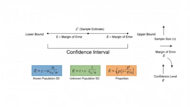
Descriptive Statistics and Confidence Intervals
A sample mean, proportion, or other descriptive estimate can be accompanied by a confidence interval when the purpose expands from describing the sample to quantifying uncertainty about a population parameter.
A generic confidence interval has the form:
Estimate ± Critical value × Standard error
The descriptive estimate remains the center of the interval, while the inferential framework adds information about sampling uncertainty.
This is the boundary between descriptive and inferential analysis. The confidence interval guide covers those probability-based procedures rather than treating an interval as merely another descriptive summary.
Descriptive Statistics Do Not Prove Hypotheses
Suppose Group A has sample mean:
80
and Group B has sample mean:
Descriptively:
Observed mean difference = 5
That is a factual summary of the observed samples.
Whether the five-unit difference provides convincing evidence of a population difference depends on:
- group variability,
- sample sizes,
- sampling design,
- dependence,
- an inferential model.
Descriptive statistics identify the observed difference.
Hypothesis testing determines how that difference compares with expected sampling uncertainty under a particular statistical model.
Descriptive Statistics Do Not Establish Causation
Suppose a scatter plot shows a strong association between variables X and Y.
Descriptively, we can say the observed values tend to move together.
We cannot conclude solely from that pattern that changing X would cause Y to change.
Possible explanations include:
- direct causation,
- reverse causation,
- confounding,
- selection,
- coincidence.
Causal conclusions require design and assumptions beyond descriptive association.
Full Descriptive Statistics Example
Consider the data:
3, 5, 7, 7, 8, 10, 12, 20
There are:
n = 8
observations.
Mean
x̄ = (3 + 5 + 7 + 7 + 8 + 10 + 12 + 20)/8
x̄ = 72/8
x̄ = 9
Median
The middle observations are:
7 and 8
Therefore:
Median = (7 + 8)/2
= 7.5
Mode
The value occurring most often is:
7
so:
Mode = 7
Range
Range = 20 − 3
= 17
The mean exceeds the median partly because the upper observation of 20 pulls the arithmetic center upward.
This suggests upper-tail influence and demonstrates why several descriptive statistics can be more informative than reporting the mean alone.
Sample Variance in the Example
The mean is:
x̄ = 9
The deviations are:
−6, −4, −2, −2, −1, 1, 3, 11
Squared deviations are:
36, 16, 4, 4, 1, 1, 9, 121
The total is:
192
Therefore:
s² = 192/(8 − 1)
s² = 192/7
s² ≈ 27.43
The corresponding sample standard deviation is:
s ≈ √27.43
s ≈ 5.24
The relatively large standard deviation reflects the spread created partly by the observation of 20.
What the Full Example Shows
The sample can now be summarized through several dimensions:
n = 8
Mean = 9
Median = 7.5
Mode = 7
Range = 17
Sample variance ≈ 27.43
Sample SD ≈ 5.24
These statistics reveal considerably more than the mean alone.
The difference between mean and median suggests upper-tail influence, while the large range and standard deviation show substantial dispersion.
A histogram or box plot would provide additional information about how that dispersion is distributed across the observations.
Grouped Descriptive Statistics
Suppose data are divided into Group A and Group B.
Reporting only an overall mean can hide meaningful differences between groups.
For example:
Group A mean = 20
Group B mean = 80
If the groups contain equal numbers of observations, their combined mean is:
50
Yet almost no individual observation may actually lie near 50 if both groups are tightly concentrated around their own means.
Descriptive statistics should therefore reflect meaningful subgroup structure when aggregation would conceal important patterns.
Simpson’s Paradox
Aggregated descriptive relationships can sometimes differ from relationships within subgroups.
A trend that appears positive in each group can weaken, disappear, or reverse after the groups are combined because their sizes or baseline levels differ.
This phenomenon is often called Simpson’s paradox.
The lesson is not that aggregated statistics are always wrong, but that descriptive conclusions can depend on how the data are grouped.
Relevant stratification should be considered before interpreting an overall percentage, mean, or association.
Choosing the Right Summary
For an approximately symmetric numerical distribution without serious extreme values, a useful combination is often:
Mean + Standard deviation.
For strongly skewed data:
Median + IQR
can provide a more robust description.
For categorical data:
Counts + percentages
are usually more meaningful than numerical averages.
For relationships between numerical variables:
Scatter plot + association measure
can be informative.
The correct descriptive summary depends on the variable type and distribution rather than a universal reporting template.
Why Graphs Should Accompany Numbers
Averages and spread measures compress the data.
That compression is useful, but it discards detail.
Two data sets can share:
the same mean,
the same standard deviation,
and even:
the same correlation
while displaying very different graphical patterns.
Graphs can reveal:
- nonlinear relationships,
- clusters,
- multimodality,
- gaps,
- influential observations.
Numerical summaries and graphs should therefore complement one another.
Descriptive Statistics Workflow
A practical descriptive analysis can follow a consistent sequence.
First, identify the observational unit and variable types. Determine whether the data are categorical, discrete numerical, continuous numerical, or paired across several variables.
Next, inspect completeness and basic validity. Count missing values, check measurement units, and investigate impossible or unusually extreme entries.
Then summarize categorical variables with frequencies and percentages and numerical variables with appropriate measures of center, spread, and position.
Finally, visualize important distributions and relationships, compare relevant subgroups, and write interpretations in the original measurement context.
The purpose is to understand the data before making more complicated statistical claims.
Common Descriptive Statistics Mistakes
A common mistake is reporting only the mean even when the distribution is strongly skewed or contains influential extreme observations. The median, IQR, and a distributional graph can reveal structure the mean conceals.
Another mistake is reporting percentages without denominators, which makes it difficult to judge the amount of data behind the percentage.
Analysts also sometimes calculate numerical averages for category codes that are merely arbitrary labels, producing a number with no substantive meaning.
Another frequent error is confusing sample statistics with population parameters and writing as though an observed sample mean were automatically the true population mean.
It is also incorrect to treat a statistically unusual observation as automatically erroneous or to delete it solely because it increases the standard deviation.
Another problem is summarizing combined groups without checking whether subgroup patterns differ substantially.
Finally, descriptive statistics should not be presented as evidence of causation or as a replacement for probability-based inference when the question concerns an unknown population.
How to Calculate Descriptive Statistics Step by Step
Start by determining the data type and sample size.
For numerical data, sort the observations when positional summaries such as the median or quartiles are needed.
Calculate a suitable measure of center:
Mean
and/or:
Median.
Then calculate an appropriate measure of spread:
Range
Variance
Standard deviation
or:
IQR.
For categorical data, count frequencies and convert them to relative frequencies or percentages when useful.
Graph the distribution, inspect unusual observations, compare relevant groups, and interpret every quantity in the original substantive context.
Avoid choosing a summary simply because its formula is familiar.
How to Report Descriptive Statistics
A concise report for approximately symmetric numerical data might state:
“The sample contained n = 120 observations with mean 52.4 and standard deviation 8.1.”
For skewed data:
“The median was 48, with Q₁ = 35 and Q₃ = 67.”
For categorical data:
“Category A contained 90 of 200 observations, or 45%.”
When distribution shape matters, include an appropriate graph rather than expecting the numerical summary to communicate everything.
When the analysis begins making population statements rather than merely describing observations, distinguish those inferential conclusions clearly from the descriptive results.
Frequently Asked Questions About Descriptive Statistics
What are descriptive statistics?
Descriptive statistics are numerical and graphical methods for summarizing and presenting the characteristics of observed data.
What are the main types of descriptive statistics?
They include measures of frequency, center, spread, position, distribution shape, and descriptive association.
What is the purpose of descriptive statistics?
Their purpose is to turn raw data into interpretable summaries that reveal important patterns without requiring users to inspect every individual observation.
What is the difference between descriptive and inferential statistics?
Descriptive statistics summarize observed data. Inferential statistics use sample information and probability models to draw conclusions about wider populations or processes.
Is the mean a descriptive statistic?
Yes.
What is the arithmetic mean formula?
x̄ = Σxᵢ/n
for a sample.
Is the median a descriptive statistic?
Yes. It describes the middle ranked position of ordered data.
Is the mode a descriptive statistic?
Yes. It identifies the most frequently occurring value or category.
What is the range formula?
Range = Maximum − Minimum
What is variance?
Variance measures squared dispersion around the arithmetic mean.
What is standard deviation?
Standard deviation is the square root of variance and expresses spread in the original measurement units.
What is the interquartile range?
IQR = Q₃ − Q₁
It describes the width of the middle half of an ordered distribution.
What is a five-number summary?
It consists of:
Minimum, Q₁, Median, Q₃, Maximum.
What is frequency?
Frequency is the number of times a value or category occurs.
What is relative frequency?
Relative frequency = Frequency / Total observations
What is cumulative frequency?
Cumulative frequency is the running total of observations at or below successive ordered values or intervals.
What is a proportion?
A proportion expresses a count as a fraction of the relevant total:
p̂ = x/n
What is the difference between a proportion and percentage?
A percentage is a proportion multiplied by 100.
What is central tendency?
Central tendency refers to statistics that describe the center of a distribution, such as mean, median, and mode.
What is dispersion?
Dispersion describes how widely observations are spread around or across the distribution.
Which is better: mean or median?
Neither is universally better. The mean is useful for arithmetic center, while the median is more resistant to extreme values and can better represent the center of skewed data.
Which is better: standard deviation or IQR?
Standard deviation is useful for mean-centered analysis and many probability models, while IQR is more resistant to extreme observations. The appropriate choice depends on distribution shape and purpose.
Can two data sets have the same mean but different standard deviations?
Yes.
Can two data sets have the same mean and standard deviation but different shapes?
Yes.
Are descriptive statistics enough to understand a data set?
Not always. Graphs and subgroup analysis can reveal patterns that numerical summaries conceal.
What is a histogram used for?
A histogram shows how numerical observations are distributed across intervals and can reveal center, spread, skewness, modes, and tails.
What is a box plot used for?
A box plot summarizes median, quartiles, IQR, and possible extreme observations in a compact graphical format.
What is a scatter plot used for?
It shows the relationship between two numerical variables and can reveal direction, curvature, clusters, and unusual observations.
Are outliers always errors?
No. They can be legitimate rare observations, measurement errors, subgroup members, or evidence of process changes.
Are descriptive statistics affected by sample size?
Their definitions do not change, but their stability as estimates of population quantities generally improves with suitable larger samples.
Can descriptive statistics be used for categorical data?
Yes. Frequencies, proportions, percentages, and modes are common descriptive summaries for categorical variables.
Should you calculate a mean for nominal categories?
Generally no. Arbitrary numerical labels assigned to unordered categories do not create a meaningful arithmetic scale.
What is the coefficient of variation?
A common form is:
CV = s/x̄
It expresses standard deviation relative to the mean for suitable ratio-scale data.
Do descriptive statistics prove a hypothesis?
No. Hypothesis testing belongs to inferential statistics.
Can descriptive statistics prove causation?
No. Observed association alone does not identify a causal mechanism.
What should be calculated first in descriptive statistics?
First identify variable types, inspect data quality, and determine the appropriate observational units; then calculate summaries suited to those variables and distributions.
What should a descriptive statistics report include?
It should usually include sample size, appropriate measures of center and spread, frequencies or percentages for categories, relevant graphical summaries, and enough context to interpret the results correctly.
What is the most important principle in descriptive statistics?
Use several complementary summaries that fit the data type and distribution, because no single average, spread measure, or graph can preserve every important feature of the observed data.