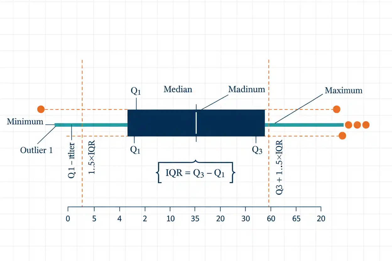
A box plot is a compact statistical graph used to summarize the center, spread, and overall distribution of numerical data through quartiles, the median, the interquartile range, whiskers, and—under common conventions—separately marked potential outliers. The central box extends from the first quartile Q₁ to the third quartile Q₃, so its length represents the interquartile range IQR = Q₃ − Q₁, while a line drawn inside the box marks the median Q₂. Whiskers extend beyond the box according to a specified rule, and one of the most widely used versions places them at the most extreme observations lying within the lower and upper 1.5×IQR fences, while observations beyond those limits are displayed individually as potential outliers. Because the graph is based largely on ranks and quartiles rather than squared deviations, a box plot is relatively resistant to a small number of extreme values and is particularly useful for comparing several groups on the same numerical scale. However, a box plot compresses the data substantially, so it does not directly show every observation, sample size, multiple distribution peaks, or the exact density of values inside the quartile regions.
Box plots are a central graphical method within descriptive statistics and the wider Statistics & Probability framework. They are especially valuable when a distribution needs to be summarized through positional measures rather than a single average, because the median, quartiles, interquartile range, whiskers, and unusual observations can all be seen in one compact display.
What Is a Box Plot?
A box plot, sometimes called a box-and-whisker plot, represents an ordered numerical distribution using a rectangular box and lines extending from it.
A typical box plot includes:
Q₁ = first quartile
Q₂ = median
Q₃ = third quartile
IQR = Q₃ − Q₁
along with lower and upper whiskers.
The box itself covers the middle:
50%
of the data in terms of rank positions, extending from Q₁ to Q₃.
The median divides that central box into lower and upper portions.
Whiskers then describe data beyond the quartiles according to the chosen box-plot convention.
Basic Box Plot Structure
A horizontal box plot can be visualized conceptually as:
lower whisker — [ Q₁ | median | Q₃ ] — upper whisker
The left or lower edge of the box represents:
Q₁
The line inside the box represents:
Q₂ = median
The right or upper edge represents:
Q₃
The length of the box is:
IQR = Q₃ − Q₁
Values beyond the whiskers can be plotted individually when a modified box-plot convention is used.
The same structure can be drawn vertically without changing its statistical meaning.
Box Plot Formula
There is no single formula that produces an entire box plot, because the graph combines several summary statistics and a whisker convention.
The most important formulas are:
IQR = Q₃ − Q₁
and, under the common 1.5×IQR rule:
Lower fence = Q₁ − 1.5(IQR)
Upper fence = Q₃ + 1.5(IQR)
Potential outliers are observations satisfying:
x < Lower fence
or:
x > Upper fence
The whiskers in a Tukey-style modified box plot usually extend to the smallest and largest observed values within the fences, not necessarily to the fence values themselves.
This distinction matters.
First Quartile Q₁
The first quartile represents a lower positional point in the ordered distribution and corresponds conceptually to the:
25th percentile.
Approximately one quarter of the observations lie at or below Q₁, although finite-sample interpolation and quartile conventions can affect the exact numerical calculation.
For example, if:
Q₁ = 20
then the lower edge of the box is drawn at:
The quartile does not have to be an observed value if the chosen calculation method interpolates between neighboring observations.
Median Q₂
The median is:
Q₂
and corresponds to the:
50th percentile.
It divides the ordered observations into lower and upper halves.
In a box plot, the median appears as a line inside the box.
If:
Median = 30
then the median line is drawn at:
Its location relative to Q₁ and Q₃ can provide descriptive information about asymmetry.
A median close to the middle of the box suggests relatively balanced central quartile spacing, while a median closer to one side can indicate asymmetric central spread.
Third Quartile Q₃
The third quartile corresponds conceptually to the:
75th percentile.
Approximately three quarters of observations lie at or below it, subject to the quartile convention used.
If:
Q₃ = 50
then the upper edge of the box is placed at:
Together:
Q₁ and Q₃
define the central half of the ordered distribution.
Their difference determines the interquartile range.
Interquartile Range
The interquartile range is:
IQR = Q₃ − Q₁
Suppose:
Q₁ = 20
and:
Q₃ = 50.
Then:
IQR = 50 − 20
IQR = 30
The box therefore spans:
30 units.
IQR measures the spread of the middle 50% of observations and is relatively resistant to isolated extreme values because the minimum and maximum do not directly determine it.
Lower Outlier Fence
The common lower fence is:
Lower fence = Q₁ − 1.5(IQR)
Using:
Q₁ = 20
IQR = 30
we obtain:
Lower fence = 20 − 1.5(30)
= 20 − 45
= −25
Any observation below:
−25
would be flagged as a potential lower outlier under this rule.
The fence itself is a threshold, not necessarily the endpoint of the whisker.
Upper Outlier Fence
The upper fence is:
Upper fence = Q₃ + 1.5(IQR)
Using:
Q₃ = 50
IQR = 30
we obtain:
Upper fence = 50 + 45
= 95
Any observation above:
95
would be flagged as a potential upper outlier.
Again, the whisker normally ends at the largest actual observation not exceeding 95 rather than at 95 unless an observation happens to equal that value.
What Are Box Plot Whiskers?
Whiskers are lines extending from the box toward values outside Q₁ and Q₃.
Their exact meaning depends on the box-plot convention.
In a common Tukey-style modified box plot:
Lower whisker = smallest observed value ≥ lower fence
Upper whisker = largest observed value ≤ upper fence
Observations beyond the fences appear separately as potential outliers.
Other box plots use the actual minimum and maximum as whisker endpoints.
Therefore, a box plot should not be interpreted correctly without knowing which whisker rule was used.
Modified Box Plot
A modified box plot uses an outlier rule rather than automatically extending whiskers to the minimum and maximum.
The common procedure is:
- calculate Q₁;
- calculate Q₃;
- find IQR;
- calculate 1.5×IQR fences;
- mark observations beyond the fences separately;
- extend whiskers to the most extreme non-outlier observations.
This version is useful because unusual tail observations become visually distinct instead of stretching the whiskers and compressing the central box.
It is one of the most widely recognized modern box-plot forms.
Min-Max Box Plot
Some box plots use the complete five-number summary:
Minimum
Q₁
Median
Q₃
Maximum
In this version, whiskers extend directly to the minimum and maximum observations.
No values are separated merely because they exceed 1.5×IQR fences.
This graph communicates the full observed range directly.
However, one extreme observation can make a whisker very long and reduce the visual resolution of the central distribution.
Box Plot Example
Consider the ordered data:
2, 4, 5, 7, 8, 9, 10, 12, 13, 15, 18
There are:
n = 11
observations.
The median is the sixth observation:
Q₂ = 9
Using the median-of-halves convention while excluding the overall median, the lower half is:
2, 4, 5, 7, 8
so:
Q₁ = 5
The upper half is:
10, 12, 13, 15, 18
so:
Q₃ = 13
Therefore:
IQR = 13 − 5
= 8
Calculate the Outlier Fences
The lower fence is:
Q₁ − 1.5(IQR)
= 5 − 1.5(8)
= 5 − 12
= −7
The upper fence is:
Q₃ + 1.5(IQR)
= 13 + 12
= 25
All observations lie between:
−7 and 25
so there are no potential outliers under the 1.5×IQR rule.
Therefore, the whiskers can extend to:
Minimum = 2
and:
Maximum = 18
for this data set.
Box Plot Summary for the Example
The box plot can be summarized as:
Lower whisker = 2
Q₁ = 5
Median = 9
Q₃ = 13
Upper whisker = 18
The box extends from:
5 to 13
with the median line at:
Its width is:
IQR = 8.
Because the median is centered evenly between Q₁ and Q₃:
9 − 5 = 4
and:
13 − 9 = 4
the central half of this particular distribution is balanced around the median.
Box Plot Example With an Outlier
Now consider:
2, 4, 5, 7, 8, 9, 10, 12, 13, 15, 40
The median remains:
Q₂ = 9
Using the same median-of-halves method:
Q₁ = 5
and:
Q₃ = 13
Therefore:
IQR = 8
The fences are:
Lower fence = −7
Upper fence = 25
The observation:
40
lies above 25.
Therefore:
40
is flagged as a potential outlier.
Whisker Locations in the Outlier Example
The observations below the upper fence include:
2, 4, 5, 7, 8, 9, 10, 12, 13, 15
The largest non-outlier is:
15
Therefore, the upper whisker ends at:
15
not:
25
and not:
The lower whisker ends at:
2
because 2 is above the lower fence.
The point:
40
is plotted separately beyond the upper whisker.
This illustrates one of the most commonly misunderstood features of box plots: fences determine eligibility, while whiskers usually end at actual observations.
Potential Outlier Does Not Mean Error
An observation beyond a 1.5×IQR fence is often called an outlier, but the graphical flag does not establish that the value is wrong.
A flagged observation might represent:
- a legitimate rare event,
- an unusual member of the population,
- a measurement error,
- a data-entry error,
- another subgroup,
- a change in the underlying process.
The box plot identifies observations deserving attention.
It does not determine their cause.
Removing an observation solely because it appears beyond the whisker can discard valid information and distort subsequent analysis.
Why Use 1.5×IQR?
The 1.5×IQR rule is a conventional threshold that provides a practical balance between marking unusually distant values and leaving ordinary tail observations within the whiskers.
It is not a universal law of probability.
Its interpretation depends on the distribution.
For an approximately normal population, the theoretical quartiles are near:
Q₁ ≈ μ − 0.6745σ
Q₃ ≈ μ + 0.6745σ
so:
IQR ≈ 1.349σ
The upper fence is then approximately:
μ + 0.6745σ + 1.5(1.349σ)
≈ μ + 2.698σ
and the lower fence is approximately:
μ − 2.698σ
This helps explain why relatively few observations from an ideal normal distribution lie outside Tukey’s fences.
Extreme Outlier Fences
Some descriptive systems also distinguish more extreme observations using:
3 × IQR
fences.
These would be:
Lower extreme fence = Q₁ − 3(IQR)
Upper extreme fence = Q₃ + 3(IQR)
Values between:
1.5×IQR
and:
3×IQR
may be described as mild potential outliers, while observations beyond 3×IQR can be treated as more extreme.
This terminology is not universal.
The exact display symbols and labels depend on the software or reporting convention used.
Quartile Calculation Methods Matter
There is no single universal finite-sample formula for Q₁ and Q₃.
Different methods may use:
- median of the lower and upper halves;
- inclusive median-of-halves rules;
- interpolated percentile positions;
- software-specific quantile definitions.
For large samples, differences among reasonable methods are usually small.
For small samples, they can change:
Q₁
Q₃
IQR
and therefore even the outlier fences.
When exact reproducibility matters, the quartile convention should be specified.
Box Plot and the Five-Number Summary
The traditional five-number summary is:
Minimum, Q₁, Median, Q₃, Maximum.
A simple min-max box plot can display these five values directly.
A modified Tukey box plot differs slightly because its whiskers can stop before the minimum or maximum when extreme observations lie beyond the outlier fences.
Those observations are then shown separately.
The five-number summary remains useful for understanding the distribution even when the modified whisker rule is applied.
What Does the Box Represent?
The box spans:
Q₁ to Q₃.
In rank terms, it represents the middle:
50%
of observations.
This does not mean the observations are uniformly distributed inside the box.
One quarter of the data conceptually lies between:
Q₁ and Median
and another quarter lies between:
Median and Q₃,
but those two intervals can have very different numerical widths.
A short interval indicates greater concentration over that part of the distribution, whereas a long interval indicates greater spread.
What Does the Median Line Show?
The median line divides the central box into two quartile intervals.
Suppose:
Q₁ = 10
Median = 12
Q₃ = 30
Then the lower middle quarter spans only:
12 − 10 = 2 units
while the upper middle quarter spans:
30 − 12 = 18 units.
Both portions contain approximately the same proportion of observations by rank, but the upper portion covers a much wider numerical interval.
That suggests greater spread above the median within the central half.
Interpreting Whisker Length
Whisker length can provide additional information about tail spread.
Suppose the lower whisker extends only:
2 units
below Q₁, while the upper whisker extends:
20 units
above Q₃.
This indicates that the non-outlier upper tail spans a much wider numerical range than the non-outlier lower tail.
Longer upper-tail structure can be consistent with right skew.
However, whisker length alone should not be treated as a complete skewness statistic because box plots omit information about density and internal distribution shape.
Identifying Right Skew From a Box Plot
A right-skewed box plot can show several descriptive features:
- the median closer to Q₁ than Q₃;
- a wider upper half of the box;
- a longer upper whisker;
- more high-side outliers.
These features indicate greater spread toward larger values.
For example:
Q₁ = 10
Median = 12
Q₃ = 20
with an upper whisker reaching 45 and a lower whisker reaching 8 would suggest substantial upper-tail extension.
The conclusion should still be treated as a graphical description rather than a formal measure of skewness.
Identifying Left Skew
A left-skewed distribution may show:
- a median closer to Q₃;
- greater box width below the median;
- a longer lower whisker;
- more low-side outliers.
For example:
Q₁ = 20
Median = 28
Q₃ = 30
with a lower whisker at 2 and upper whisker at 33 can suggest a longer lower tail.
As with right skew, the box plot provides an abbreviated view.
A histogram or density display can reveal shape more directly.
Symmetric Box Plot
For an approximately symmetric distribution, the median can lie near the middle of the box and the two whiskers can have similar lengths.
Suppose:
Lower whisker = 0
Q₁ = 10
Median = 20
Q₃ = 30
Upper whisker = 40
This configuration is visually symmetric around:
However, a symmetric box plot does not prove the underlying distribution is normal.
Many non-normal symmetric distributions can produce similar quartile structure.
Box Plot vs Histogram
A histogram displays how frequently observations occur within numerical intervals.
A box plot displays selected positional summaries.
A histogram can reveal:
- multiple peaks,
- gaps,
- local density,
- detailed skewness.
A box plot cannot show these features directly.
However, box plots are much more compact and make group comparisons easier, particularly when dozens of distributions need to be displayed side by side.
The two graph types therefore complement one another.
Box Plot vs Arithmetic Mean
The arithmetic mean is a numerical measure of arithmetic center:
x̄ = Σxᵢ/n.
A standard box plot is instead centered visually around:
the median
and quartiles.
The arithmetic mean is generally not required to construct the ordinary box plot.
Some software displays a mean marker in addition to the median, which can be useful because a large difference between mean and median can indicate tail influence or skewness.
However, the mean should not be assumed to be the line inside the box; that line normally represents the median.
Box Plot vs Standard Deviation
Standard deviation measures squared-deviation-based dispersion around the mean.
A box plot represents spread primarily through:
IQR
and whisker lengths.
Standard deviation is strongly affected by extreme values.
IQR is much more resistant.
For highly skewed distributions, the median and IQR represented by a box plot can therefore communicate central structure more robustly than mean and standard deviation alone.
For approximately symmetric well-behaved distributions, both sets of summaries can provide useful complementary information.
Box Plot vs Coefficient of Variation
The coefficient of variation measures relative dispersion using a form such as:
CV = s/x̄.
A box plot does not normalize spread by the mean.
Instead, it displays absolute position and quartile spread on the original numerical scale.
The coefficient of variation can help compare relative variability between suitable positive ratio-scale variables, while box plots are especially useful when comparing entire distribution positions and quartile structures on a common scale.
They answer different descriptive questions.
Box Plot vs Cumulative Frequency
A cumulative frequency distribution records the running number or proportion of observations at or below successive values.
Quartile positions can be estimated from cumulative-frequency information because:
Q₁ corresponds approximately to 25%
Median to 50%
Q₃ to 75%.
A box plot then compresses those positional results into a graphical summary.
Cumulative frequency preserves more information about the accumulation of observations across the scale, while the box plot provides a faster visual comparison of selected landmarks.
Side-by-Side Box Plots
One of the strongest uses of box plots is comparing several groups.
Suppose Group A has:
Median = 20
IQR = 8
while Group B has:
Median = 35
IQR = 20.
A side-by-side display immediately shows that Group B has both:
a higher central position
and:
greater central spread.
Potential outliers and asymmetric tails can also be compared.
Because all groups share the same axis, visual differences in location and spread are easy to identify.
Comparing Medians Across Groups
If two boxes are drawn on the same scale, their median lines provide a quick descriptive comparison of central positions.
Suppose:
Median A = 50
Median B = 80.
Group B has the higher sample median.
However, the box plot alone does not determine whether the population medians differ statistically.
The observed difference could reflect sampling variability.
Inferential conclusions require an appropriate statistical procedure rather than visual distance alone.
Comparing IQRs Across Groups
The physical width or height of each box represents its IQR.
Suppose:
IQR_A = 5
and:
IQR_B = 25.
Group B’s middle 50% spans five times the numerical range of Group A’s middle 50%.
This indicates greater central dispersion.
It does not necessarily imply that Group B has a larger standard deviation, although that may also be true.
Different spread measures respond differently to tails and extreme observations.
Overlapping Box Plots
If two side-by-side boxes overlap substantially, it does not automatically mean their populations are statistically indistinguishable.
Likewise, non-overlapping boxes do not by themselves constitute a formal significance test.
Ordinary box boundaries are quartiles, not conventional standard errors.
Their overlap therefore has a descriptive meaning rather than a universal inferential rule.
If inference about a parameter is required, use a procedure constructed specifically for that purpose.
Notched Box Plots
A notched box plot includes an indentation around the median intended to provide a rough visual indication of uncertainty around the median.
One commonly used approximate notch half-width is:
1.58(IQR)/√n
so an approximate notch can extend:
Median ± 1.58(IQR)/√n
Different implementations can use different methods, including bootstrap approaches.
Therefore, notch interpretation depends on the plotting software and method.
A notch is not automatically identical to a conventional confidence interval for the population median.
Box Plot Orientation
A box plot can be horizontal or vertical.
Orientation does not change its statistical meaning.
Horizontal box plots are often useful when:
- group names are long;
- the numerical axis is naturally read left to right;
- several categories are stacked vertically.
Vertical box plots are common when:
- groups naturally occupy the horizontal axis;
- the numerical variable is interpreted vertically.
The important requirement is a clearly labeled numerical scale.
Box Width
In a basic box plot, the visual thickness of the box often has no numerical meaning.
Some specialized box plots vary box width according to:
- sample size,
- group frequency,
- another weighting scheme.
Unless such encoding is explicitly stated, readers should not infer that a wider-looking rectangular box represents a larger IQR in the dimension perpendicular to the numerical axis.
Only the box’s span along the numerical scale determines IQR.
Sample Size Is Usually Not Visible
A conventional box plot can make a sample of:
n = 10
look visually similar to a sample of:
n = 10,000
if their quartiles happen to be similar.
This is an important limitation.
The second sample generally provides much more stable estimates of the population quartiles, but ordinary box geometry does not communicate that directly.
When sample sizes differ materially across groups, reporting:
n
beside the boxes can prevent misleading comparisons.
Box Plot With Very Small Samples
Box plots are less informative when sample size is extremely small.
With:
n = 4
or:
n = 5,
quartiles depend heavily on only a few observations and on the exact quartile convention.
A box plot can still be calculated, but its smooth visual structure can imply more distributional information than the data actually contain.
For small samples, plotting individual points alongside the box plot can provide a more transparent representation.
Box Plot With Large Samples
For large samples, quartile estimates usually become more stable under suitable sampling conditions.
However, a box plot still displays only a handful of summary statistics.
A large multimodal data set can produce a perfectly ordinary-looking box plot even when the full distribution contains several distinct peaks.
Therefore, large sample size does not remove the need for richer distributional graphics when shape matters.
The box plot remains valuable for compact comparison rather than exhaustive representation.
Box Plot With Repeated Values
Repeated observations can cause:
Q₁
Median
or:
Q₃
to have identical values.
For example:
5, 5, 5, 5, 5, 10, 20
can produce a lower part of the box compressed at 5.
In more extreme cases:
IQR = 0.
When IQR is zero, the 1.5×IQR fences collapse to:
Q₁ = Q₃.
Any observation differing from that value can then be flagged by the mechanical fence rule.
Such cases require contextual interpretation rather than automatic deletion of every flagged point.
What Does IQR = 0 Mean?
If:
Q₁ = Q₃
then:
IQR = 0.
This indicates that at least the central half of the ordered distribution is concentrated at one value or over effectively zero numerical width under the quartile convention.
The box can collapse into a line.
This often occurs with highly discrete data containing many repeated values.
The box plot remains mathematically valid, but outlier fences based on 1.5×IQR can become extremely restrictive.
Box Plot for Discrete Data
A box plot can summarize discrete numerical variables, such as:
number of purchases
or:
number of defects.
However, repeated integer values can make quartiles coincide and create compressed boxes or whiskers.
A frequency plot can often provide additional information because it shows exactly how many observations occur at each discrete value.
The box plot remains useful when the main interest is group comparison of center and spread.
Box Plot for Continuous Data
Box plots are especially common for continuous measurements such as:
height,
response time,
mass,
temperature.
For these variables, quartiles can divide a wide range of observed values and provide a concise representation of central dispersion.
When several continuous distributions must be compared across groups, box plots can often communicate differences more efficiently than separate histograms.
Can a Box Plot Show the Mean?
A standard box plot does not need to display the arithmetic mean.
Its internal line usually marks:
Median.
Some implementations add a dot, cross, or another symbol to show:
Mean.
If both are shown, their separation can be informative.
For example, a mean well above the median may reflect a long upper tail or influential high values.
The plotting legend should make the symbols clear.
Box Plot and Normal Distribution
For a theoretical normal distribution:
Median = μ
and the quartiles occur approximately at:
μ ± 0.6745σ.
Therefore:
IQR ≈ 1.349σ.
The central box is symmetric around μ.
Under the common 1.5×IQR rule, the theoretical fences occur around:
μ ± 2.698σ.
A normal sample can still produce asymmetric whiskers and sample outliers because finite random samples do not perfectly reproduce population symmetry.
Normal Outliers Are Still Possible
Even when the true population is perfectly normal, there is positive probability of observing values beyond the Tukey fences.
Therefore, seeing one or more box-plot outliers does not automatically imply:
non-normal data
or:
bad measurements.
As sample size grows, there are more opportunities for rare tail observations to appear.
A large normal sample can therefore contain several legitimate points beyond the 1.5×IQR fences.
Outlier flags should always be interpreted in the context of sample size and the underlying process.
Box Plot and Skewed Distributions
Box plots can be particularly helpful for skewed data because they do not depend on the arithmetic mean or standard deviation for their central geometry.
Consider a right-skewed income distribution.
Its upper whisker may be long, the median may sit closer to Q₁, and multiple high observations may appear beyond the upper fence.
These graphical features can reveal tail asymmetry quickly.
However, the box plot still compresses all detail inside each quartile interval, so a histogram can provide a fuller picture.
Box Plot and Transformations
If all values are transformed by a positive linear function:
Y = aX + b
where:
a > 0,
the quartiles transform as:
Q₁,Y = aQ₁,X + b
Median_Y = aMedian_X + b
Q₃,Y = aQ₃,X + b
and:
IQR_Y = aIQR_X.
Therefore, the basic relative shape of the box plot is preserved under positive linear changes of units.
The graph is simply shifted and rescaled.
Negative Linear Transformations
If:
a < 0
in:
Y = aX + b,
the ordering reverses.
The former upper tail becomes the lower tail, and quartile positions swap accordingly after transformation.
The IQR scales by:
|a|.
This illustrates that box plots describe ordinal position and numerical spacing together.
Changing the direction of the measurement scale reverses the visual orientation of the distribution.
Logarithmic Transformations
A nonlinear transformation such as:
Y = ln(X)
does more than simply rescale the box plot.
It can compress large upper values and change numerical spacing between quartiles.
For strongly right-skewed positive data, a log-scale box plot can sometimes reveal multiplicative structure more clearly than a box plot on the original scale.
However, interpretation must then be made on the transformed scale or carefully converted back.
Comparing Box Plots on Different Scales
Two box plots should not be compared visually for absolute spread unless they use the same numerical scale.
A box that appears twice as long in two separate graphics may not have twice the IQR if the axes have different ranges.
For reliable comparison, use:
- a shared axis;
- clearly displayed scale values;
- consistent units.
Visual size alone is not statistical information when plotting scales differ.
Box Plot and Relative Variability
A box plot presents absolute quartile distances, so a distribution centered around:
1,000
with IQR:
100
has a visually larger box than one centered around:
10
with IQR:
5
on the same raw scale.
Yet relative to their centers:
100/1000 = 10%
and:
5/10 = 50%.
This is one reason raw box-plot spread and relative measures such as coefficient of variation answer different questions.
Can Box Plots Show Multimodality?
Not reliably.
Suppose a data set contains two tight clusters:
one near 10
and:
another near 100.
Its box plot can show a large IQR and wide central spread but cannot reveal that almost no observations occur between the two clusters.
A histogram, density plot, or dot plot would show the bimodal structure immediately.
This is one of the major limitations of box plots.
Can Box Plots Show Gaps?
Not directly.
Suppose observations occur between:
0–10
and:
50–60
with nothing between 10 and 50.
The quartiles and median can still create an ordinary-looking box.
The box plot does not indicate where every empty interval occurs.
Graphs retaining more information about data density are needed when gaps are important.
Can Box Plots Show Sample Density?
No.
Each quartile region contains roughly the same fraction of observations, regardless of how wide that numerical region is.
A very narrow interval can contain 25% of the observations, while another 25% can spread across a much wider interval.
The box plot communicates this indirectly through quartile spacing but does not show local density continuously.
A violin plot or histogram can provide richer density information.
Box Plot and Confidence Intervals
Ordinary box edges and whiskers are descriptive summaries, not confidence interval endpoints.
For example:
Q₁ and Q₃
describe sample positions.
They do not represent a 50% confidence interval for the population mean.
Likewise, Tukey whiskers are based on IQR fences rather than a specified confidence level.
Notched box plots can introduce approximate median uncertainty, but the exact method must be identified before interpreting the notch inferentially.
Box Plot and Statistical Significance
Two box plots whose boxes do not overlap can look substantially different, but that visual observation is not a universal hypothesis test.
Statistical significance depends on:
- sample size,
- estimator variability,
- dependence,
- study design,
- target parameter.
A small sample can have widely separated boxes by chance.
A huge sample can have very similar-looking boxes yet support precise evidence of a small population difference.
Descriptive and inferential conclusions should remain distinct.
Common Box Plot Mistakes
A common mistake is assuming that whiskers always represent the minimum and maximum. In a modified Tukey box plot, whiskers generally stop at the most extreme observations still lying within the 1.5×IQR fences.
Another mistake is treating the actual fence value as the whisker endpoint even when no observation occurs there.
A third error is assuming that every point outside a whisker is a data error. The box plot identifies potential outliers, not confirmed mistakes.
Analysts also sometimes interpret the line inside the box as the arithmetic mean, even though it normally represents the median.
Another mistake is concluding that two groups differ significantly because their boxes or medians appear separated. An ordinary box plot is primarily descriptive.
It is also incorrect to assume that a symmetric-looking box plot proves normality.
Finally, interpreting a box plot without knowing the quartile and whisker convention can lead to incorrect conclusions when different software uses different definitions.
How to Make a Box Plot Step by Step
Begin by sorting the numerical observations from smallest to largest.
Next determine:
Q₁
Median
Q₃
using the chosen quartile convention.
Then calculate:
IQR = Q₃ − Q₁.
If using the common modified box plot, calculate:
Lower fence = Q₁ − 1.5(IQR)
Upper fence = Q₃ + 1.5(IQR).
Identify the smallest observation that remains within the lower fence and the largest observation remaining within the upper fence. These become the whisker endpoints.
Draw the box from Q₁ to Q₃, mark the median inside it, draw whiskers to the selected endpoints, and display observations beyond the fences individually.
Full Box Plot Worked Example
Consider:
1, 3, 4, 5, 6, 7, 8, 9, 10, 12, 30
There are:
n = 11
observations.
The median is the sixth observation:
Median = 7
Exclude the median and take the lower half:
1, 3, 4, 5, 6
Its median is:
Q₁ = 4
The upper half is:
8, 9, 10, 12, 30
Its median is:
Q₃ = 10
Therefore:
IQR = 10 − 4
IQR = 6
Calculate the Fences
Lower fence:
Q₁ − 1.5(IQR)
= 4 − 1.5(6)
= 4 − 9
= −5
Upper fence:
Q₃ + 1.5(IQR)
= 10 + 9
= 19
The observation:
30
is greater than:
19
so it is flagged as a potential outlier.
All other observations lie within the fences.
Determine the Whiskers
The smallest observed value within the lower fence is:
1
so:
Lower whisker = 1
The largest observed value at or below the upper fence is:
12
so:
Upper whisker = 12
The value:
30
is plotted separately.
The final modified box plot therefore uses:
Lower whisker = 1
Q₁ = 4
Median = 7
Q₃ = 10
Upper whisker = 12
Potential outlier = 30
Interpret the Worked Example
The middle 50% of the data lies between:
4 and 10
with:
IQR = 6.
The median:
7
lies exactly midway between Q₁ and Q₃:
7 − 4 = 3
10 − 7 = 3.
The non-outlier whiskers are also fairly short, but the separate observation:
30
creates a pronounced upper extreme.
A standard mean and standard deviation would be influenced considerably by 30, whereas the quartile-based box structure remains relatively stable.
This is one reason box plots are useful when extreme values are present.
Comparing the Mean in the Worked Example
For the data:
1, 3, 4, 5, 6, 7, 8, 9, 10, 12, 30
the arithmetic mean is:
x̄ = 95/11
x̄ ≈ 8.64
while:
Median = 7.
The upper outlier pulls the mean above the median.
The box plot itself centers its primary display on the median, so it resists this pull.
Adding a separate mean marker could make the difference between the two centers visible.
Box Plot Without the Extreme Value
If 30 is removed, the data become:
1, 3, 4, 5, 6, 7, 8, 9, 10, 12
The central quartiles change only modestly depending on the chosen finite-sample convention.
The arithmetic mean, however, drops substantially because the large value no longer contributes to the total.
This demonstrates the robustness of quartile-based displays relative to mean-based summaries.
Robustness does not make a box plot universally superior; it simply makes it less sensitive to isolated extremes.
How to Report a Box Plot
A useful textual description can state the median, IQR, whiskers, and important outliers.
For example:
“The distribution had a median of 7, with Q₁ = 4 and Q₃ = 10, giving an IQR of 6. Under the 1.5×IQR rule, the whiskers extended from 1 to 12 and the value 30 was flagged as a potential upper outlier.”
When comparing groups, report the main descriptive differences:
“Group B had a higher median and a wider IQR than Group A.”
Avoid converting graphical observations directly into population or causal conclusions unless an appropriate inferential analysis supports them.
Frequently Asked Questions About the Box Plot
What is a box plot?
A box plot is a graphical summary of numerical data based primarily on the median, quartiles, IQR, whiskers, and potential outliers.
What is another name for a box plot?
It is often called a:
box-and-whisker plot.
What does the box represent?
The box extends from:
Q₁ to Q₃
and therefore covers the middle 50% of the ordered distribution by rank.
What does the line inside the box mean?
It usually represents:
Median = Q₂.
Does the line inside a box plot show the mean?
Normally no. The ordinary internal line represents the median, although some plots add a separate mean marker.
What is the IQR formula?
IQR = Q₃ − Q₁
What is the lower outlier fence?
Q₁ − 1.5(IQR)
What is the upper outlier fence?
Q₃ + 1.5(IQR)
Are the fences the same as the whiskers?
Not necessarily. In a common modified box plot, whiskers extend to the most extreme actual observations still within the fences.
Do box plot whiskers always show minimum and maximum?
No. Some versions do, while modified Tukey box plots typically use the most extreme non-outlier observations.
What is an outlier in a box plot?
Under the common 1.5×IQR rule, an observation is flagged when it lies below the lower fence or above the upper fence.
Does an outlier mean the observation is wrong?
No. It is only a statistical flag for an unusually distant value under the chosen rule.
Should box plot outliers be deleted?
Not automatically. Their cause and validity should be investigated.
What is Q₁?
Q₁ is the first quartile, corresponding conceptually to the 25th percentile.
What is Q₂?
Q₂ is the median.
What is Q₃?
Q₃ is the third quartile, corresponding conceptually to the 75th percentile.
Can different software produce different box plots?
Yes. Different quartile algorithms and whisker definitions can produce slightly different results, especially for small samples.
Does every quartile calculation method give the same result?
No. Finite-sample quartiles have multiple accepted conventions.
What does a long box mean?
A long box means the middle 50% of observations has a large numerical spread.
What does a short box mean?
It means the middle 50% is relatively concentrated.
What does a long upper whisker suggest?
It can indicate greater spread in the upper non-outlier tail.
What does a long lower whisker suggest?
It can indicate greater spread in the lower non-outlier tail.
How can a box plot suggest right skew?
A relatively long upper side, median shifted toward Q₁, and high-side outliers can suggest right skew.
How can it suggest left skew?
A longer lower side, median shifted toward Q₃, and low-side outliers can suggest left skew.
Does a symmetric box plot prove normality?
No.
Can a normal sample have box plot outliers?
Yes. Legitimate normal observations can occasionally fall beyond 1.5×IQR fences.
What is a five-number summary?
It is:
Minimum, Q₁, Median, Q₃, Maximum.
Is a modified box plot exactly the same as a five-number summary plot?
Not always, because whiskers can stop before the minimum or maximum when potential outliers are displayed separately.
What is a notched box plot?
It adds an indentation around the median intended to communicate approximate uncertainty about the median under a specified method.
Is a notch automatically a 95% confidence interval?
No. Its exact interpretation depends on how the plotting method calculates the notch.
Can a box plot compare multiple groups?
Yes. Side-by-side box plots are particularly useful for comparing medians, IQRs, tail spread, and potential outliers across groups.
Does non-overlap between boxes prove statistical significance?
No.
Can overlapping boxes still represent statistically different populations?
Yes. Inferential significance depends on sample size and sampling uncertainty, not box overlap alone.
Can a box plot show sample size?
Not usually in its ordinary form.
Can a box plot show every observation?
No, although individual points can be overlaid.
Can a box plot reveal multiple peaks?
Not reliably.
Can a box plot show gaps in the data?
Not reliably.
Is a histogram better than a box plot?
Neither is universally better. Histograms reveal distribution detail, while box plots are more compact and often better for comparing many groups.
What happens when IQR equals zero?
The box can collapse to zero width along the numerical axis, and the 1.5×IQR outlier rule can flag any different observations aggressively.
Can box plots be used with discrete data?
Yes, although repeated values can make quartiles and whiskers coincide.
Can box plots be used with categorical data?
The variable being summarized must be numerical or at least ordered quantitatively; categories can be used to define separate groups of numerical box plots.
What is the main advantage of a box plot?
It summarizes center, central spread, tail extent, and potential unusual values compactly while being relatively resistant to extreme observations.
What is the main limitation of a box plot?
It compresses the data heavily and can conceal multimodality, gaps, exact density, and sample size.
What is the most important rule when interpreting a box plot?
Identify the quartile and whisker convention first, then interpret the median, IQR, whiskers, and flagged observations as descriptive features rather than assuming that outliers are errors or that visible group differences automatically imply statistical significance.