Frequency Distribution: Definition, Formula & Example

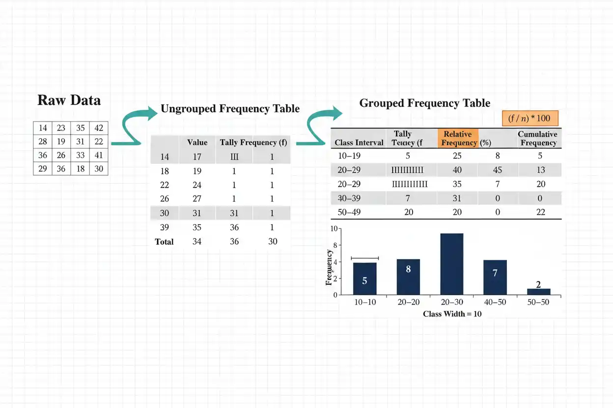
A frequency distribution is an organized summary showing how often values, categories, or numerical intervals occur within a data set, making it easier to see concentration, spread, repetition, gaps, and the overall pattern of observations. Instead of reading a long list of raw measurements individually, a frequency distribution groups identical values or ranges together and records the number of observations associated with each one, with those counts called frequencies. A distribution can be ungrouped, where each distinct value is listed separately, or grouped, where numerical observations are combined into class intervals such as 0–10, 10–20, and 20–30. Frequencies can also be converted into relative frequencies, percentages, cumulative frequencies, or densities depending on the analytical purpose, while graphical displays such as histograms and frequency polygons can represent the same underlying structure visually. A well-constructed frequency distribution therefore does more than shorten a data set: it exposes how observations are allocated across the measurement scale and creates the foundation for calculating positional statistics, probabilities, grouped-data estimates, and many other descriptive quantities.
Frequency distributions form a core part of descriptive statistics within Statistics & Probability. They are especially useful before more compressed summaries are calculated because a table of frequencies preserves much more distributional information than a single mean, standard deviation, or other one-number statistic.
What Is a Frequency Distribution?
A frequency distribution records the number of observations belonging to each distinct value, category, or numerical class.
Suppose the raw data are:
1, 2, 2, 3, 3, 3, 4, 4, 5
Instead of listing all nine observations, organize them as:
| Value | Frequency |
|---|---|
| 1 | 1 |
| 2 | 2 |
| 3 | 3 |
| 4 | 2 |
| 5 | 1 |
The frequency distribution immediately shows that:
3
is the most common value, occurring:
3 times.
It also shows that the data are symmetric in frequency around 3.
The total of all frequencies must equal the total number of observations.
Frequency Distribution Formula
If a value or class occurs:
fᵢ
times, its frequency is simply that count.
For a complete distribution:
Σfᵢ = n
where:
- fᵢ = frequency of the ith value or class
- n = total number of observations
In the previous table:
Σf = 1 + 2 + 3 + 2 + 1
= 9
which matches:
n = 9.
This equality is one of the easiest ways to verify that all observations have been counted exactly once.
What Is Frequency?
Frequency means the number of observations having a specified value or belonging to a specified category or interval.
For example, suppose scores are:
10, 10, 20, 20, 20, 30
Then:
Frequency of 10 = 2
Frequency of 20 = 3
Frequency of 30 = 1
Frequency is an absolute count.
It should not be confused with relative frequency, which expresses the same count as a fraction or percentage of the total.
Ungrouped Frequency Distribution
An ungrouped frequency distribution lists each distinct observed value separately.
Suppose:
2, 2, 3, 4, 4, 4, 5, 6, 6
The table is:
| Value | Frequency |
|---|---|
| 2 | 2 |
| 3 | 1 |
| 4 | 3 |
| 5 | 1 |
| 6 | 2 |
This format preserves exact observed values.
It is particularly useful when:
- the number of distinct values is small;
- values are discrete;
- exact frequencies matter.
If hundreds or thousands of unique measurements occur, however, an ungrouped table can become too long to interpret efficiently.
Grouped Frequency Distribution
A grouped frequency distribution combines numerical observations into intervals.
Suppose a large set of scores ranges from:
0 to 100.
Instead of displaying every individual score, use classes such as:
0–10
10–20
20–30
and so on.
A grouped table might look like:
| Score Interval | Frequency |
|---|---|
| 0–10 | 4 |
| 10–20 | 8 |
| 20–30 | 15 |
| 30–40 | 20 |
| 40–50 | 13 |
Grouping makes broad distribution structure easier to see.
The tradeoff is information loss because exact values within each class are no longer visible.
Categorical Frequency Distribution
Frequency distributions are not limited to numerical data.
Suppose responses are:
Red, Blue, Blue, Green, Red, Blue
Then:
| Category | Frequency |
|---|---|
| Red | 2 |
| Blue | 3 |
| Green | 1 |
For nominal categories such as colors, the category order may be arbitrary.
Relative frequencies and percentages are often particularly helpful in categorical distributions because they show each category’s share of the total.
Cumulative frequency is generally inappropriate unless the categories possess a meaningful order.
Relative Frequency Distribution
Relative frequency expresses each frequency as a proportion of the total:
Relative frequency = fᵢ/n
Suppose:
n = 20
and one category occurs:
f = 5
times.
Then:
Relative frequency = 5/20
= 0.25
or:
25%.
Relative frequency is useful when comparing distributions with different sample sizes because proportions can be compared directly even when raw counts differ substantially.
Relative Frequency Example
Suppose:
| Category | Frequency |
|---|---|
| A | 8 |
| B | 12 |
| C | 20 |
Total:
n = 40
Relative frequencies are:
A: 8/40 = 0.20
B: 12/40 = 0.30
C: 20/40 = 0.50
Therefore:
| Category | Frequency | Relative Frequency |
|---|---|---|
| A | 8 | 0.20 |
| B | 12 | 0.30 |
| C | 20 | 0.50 |
The relative frequencies sum to:
1.00
or:
100%.
Percentage Frequency
Percentage frequency is simply relative frequency multiplied by 100:
Percentage frequency = (fᵢ/n) × 100%
For:
f = 12
and:
n = 40
we obtain:
Percentage frequency = 12/40 × 100%
= 30%
Thus, frequency, relative frequency, and percentage frequency describe the same category at different scales:
12
0.30
30%
respectively.
Cumulative Frequency Distribution
A cumulative frequency distribution records the running total of frequencies through ordered values or intervals.
Suppose:
| Value | Frequency |
|---|---|
| 1 | 3 |
| 2 | 5 |
| 3 | 4 |
| 4 | 2 |
The cumulative frequencies are:
3
3 + 5 = 8
8 + 4 = 12
12 + 2 = 14
giving:
| Value | Frequency | Cumulative Frequency |
|---|---|---|
| 1 | 3 | 3 |
| 2 | 5 | 8 |
| 3 | 4 | 12 |
| 4 | 2 | 14 |
The final cumulative frequency equals:
n = 14.
Frequency vs Cumulative Frequency
Ordinary frequency describes one class.
Cumulative frequency describes that class plus everything preceding it.
Suppose:
Frequency for 30–40 = 7
but cumulative frequency through 30–40 is:
The first statement means:
7 observations
belong specifically to the 30–40 class.
The second means:
25 observations
have accumulated from the beginning of the distribution through that class.
The distinction matters when answering percentile, median, and threshold questions.
Class Intervals
A class interval defines a range into which observations are grouped.
For example:
10 ≤ x < 20
means values from 10 up to, but not including, 20 belong to that class.
A sequence might be:
0 ≤ x < 10
10 ≤ x < 20
20 ≤ x < 30
The classes should generally be:
- mutually exclusive;
- collectively exhaustive for the data being summarized.
No observation should be counted in two classes, and every valid observation should belong to one class.
Class Limits
Class limits are the stated lowest and highest values associated with a class.
For integer data, a class written:
10–19
has:
Lower class limit = 10
Upper class limit = 19.
The next class might be:
20–29.
For continuous data, class boundaries often provide a cleaner mathematical representation than integer-style limits.
Class Boundaries
Class boundaries identify the actual numerical edges separating adjacent intervals.
For measurements rounded to the nearest integer, classes:
10–19
20–29
can have continuous boundaries:
9.5–19.5
19.5–29.5.
These boundaries eliminate apparent gaps between 19 and 20.
In practice, modern grouped tables can instead state classes directly as:
10 ≤ x < 20
which makes the boundary convention explicit.
Class Width
For equal-width classes:
Class width = Upper boundary − Lower boundary
Suppose a class is:
20 ≤ x < 30.
Then:
Class width = 30 − 20
= 10.
If successive lower boundaries are:
0, 10, 20, 30
the width is also the difference between adjacent boundaries:
Consistent class widths make grouped distributions and histograms easier to compare.
Choosing Class Width
A class width that is too small can produce a noisy frequency distribution with many nearly empty rows.
A class width that is too large can hide:
- skewness;
- gaps;
- clusters;
- multiple peaks.
There is no universally best number of classes for every data set.
The appropriate choice depends on:
- sample size;
- numerical range;
- measurement precision;
- purpose of the analysis.
Trying several sensible widths can reveal whether important conclusions depend heavily on grouping choices.
Number of Classes
A rough exploratory rule sometimes used is Sturges’ formula:
k ≈ 1 + log₂(n)
An equivalent form is:
k ≈ 1 + 3.322 log₁₀(n)
where:
k = approximate number of classes.
For:
n = 100
we get:
k ≈ 1 + log₂(100)
≈ 1 + 6.644
≈ 7.644
so approximately:
8 classes.
This is only a heuristic.
It is not an obligation, and other binning rules can be preferable depending on distribution shape and sample size.
Approximate Class Width From Range
If k classes are desired, a rough width can be calculated as:
Class width ≈ Range/k
where:
Range = Maximum − Minimum.
Suppose:
Minimum = 12
Maximum = 92
Then:
Range = 80.
If:
k = 8
classes are selected:
Width ≈ 80/8
= 10.
One could therefore construct classes of width approximately 10 while adjusting boundaries so all observations are included cleanly.
Class Midpoint
The midpoint of a class is:
Midpoint = (Lower boundary + Upper boundary)/2
For:
20 ≤ x < 30
the midpoint is:
(20 + 30)/2
= 25.
Midpoints are useful when estimating numerical summaries from grouped data.
Because exact values have been discarded, the midpoint often acts as a representative value for every observation in the class.
This introduces approximation error unless the observations really are concentrated near the midpoint.
Grouped Mean
A mean can be approximated from a grouped frequency distribution using:
x̄ ≈ Σfm/Σf
where:
- f = class frequency
- m = class midpoint.
Suppose:
| Interval | Frequency | Midpoint |
|---|---|---|
| 0–10 | 4 | 5 |
| 10–20 | 6 | 15 |
| 20–30 | 10 | 25 |
Then:
Σfm = 4(5) + 6(15) + 10(25)
= 20 + 90 + 250
= 360
Total:
Σf = 20
Therefore:
x̄ ≈ 360/20
= 18
The result is approximate because actual observations within each interval are unknown.
Why Grouping Loses Information
Suppose the class:
20–30
contains:
10 observations.
Those values could be:
20.1, 20.2, 20.3, …
or clustered around:
The grouped table reveals only that all ten fall somewhere within the interval.
When the midpoint:
25
is used as their representative value, their exact positions are ignored.
Therefore, grouped means, variances, and other numerical summaries should be identified as estimates when raw observations are unavailable.
Frequency Density
When class widths differ, raw frequency is not sufficient to determine histogram bar height.
Frequency density is:
Frequency density = Frequency / Class width
Suppose:
Class A width = 10, frequency = 20
Then:
Density = 20/10
= 2.
Suppose:
Class B width = 20, frequency = 30
Then:
Density = 30/20
= 1.5.
Even though B contains more observations, A has the greater concentration per unit of measurement.
Why Frequency Density Matters
In a histogram with unequal class widths, bar area should represent frequency.
If bar height were simply frequency, wider classes would receive extra visual area merely because they span more of the horizontal axis.
Using:
Height = Frequency density
ensures:
Bar area = Class width × Frequency density
= Frequency.
Thus, histogram area remains proportional to the number of observations.
For equal-width classes, frequency and frequency-density heights differ only by a common scaling factor, so ordinary frequency bars are sufficient.
Relative Frequency Density
A relative-frequency histogram can use:
Relative frequency density = Relative frequency / Class width
Since:
Relative frequency = f/n
we have:
Relative frequency density = f/(n × width)
The total area of all bars then equals:
1
when every observation is included.
This makes the histogram behave analogously to a probability-density representation.
The area over a range represents the proportion of observations within that range.
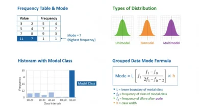
Frequency Distribution and the Mode
For an ungrouped frequency distribution, the mode is the value with the highest frequency.
Suppose:
| Value | Frequency |
|---|---|
| 1 | 2 |
| 2 | 7 |
| 3 | 5 |
| 4 | 1 |
Then:
Mode = 2.
For grouped data, the class with the highest frequency is called the:
modal class.
The exact mode cannot necessarily be determined from grouped data because individual values within that class are unknown.
Bimodal Frequency Distribution
A distribution can have two prominent frequency peaks.
Suppose:
| Value | Frequency |
|---|---|
| 1 | 2 |
| 2 | 8 |
| 3 | 3 |
| 4 | 2 |
| 5 | 9 |
| 6 | 2 |
The values:
2 and 5
both form strong peaks.
This can indicate:
- two underlying subgroups;
- two common operating states;
- mixed populations.
A single arithmetic average may conceal such structure, while the frequency distribution makes it visible immediately.
Multimodal Distribution
A frequency distribution with several distinct peaks is called multimodal.
Multiple modes can occur naturally when observations come from several processes or populations.
For example, a distribution of commuting times might show separate concentrations for:
short local trips,
moderate suburban trips,
long-distance travel.
Grouping choices can affect whether such peaks remain visible.
Very broad classes may merge several modes into one apparent peak.
Gaps in a Frequency Distribution
A gap occurs where one or more values or intervals contain:
frequency = 0.
Suppose:
| Interval | Frequency |
|---|---|
| 0–10 | 8 |
| 10–20 | 11 |
| 20–30 | 0 |
| 30–40 | 9 |
The empty 20–30 class may indicate:
- separated subgroups;
- a measurement threshold;
- sampling variation;
- missing data;
- a genuine structural gap.
A mean and standard deviation alone would not reveal this pattern.
Shape of a Frequency Distribution
The distribution can be:
- symmetric;
- right-skewed;
- left-skewed;
- unimodal;
- bimodal;
- multimodal;
- approximately uniform.
A frequency table provides the counts needed to examine these patterns.
Graphical displays often make them easier to recognize.
Understanding shape matters because different measures of center and spread behave differently under skewness, long tails, and multiple peaks.
Symmetric Frequency Distribution
A frequency distribution is approximately symmetric when frequencies on opposite sides of the center display similar patterns.
For example:
| Value | Frequency |
|---|---|
| 1 | 2 |
| 2 | 5 |
| 3 | 8 |
| 4 | 5 |
| 5 | 2 |
The center is:
3
and frequencies mirror one another:
2, 5, 8, 5, 2.
This is a strongly symmetric pattern.
Symmetry does not necessarily imply that the distribution is normal, because many other symmetric shapes are possible.
Right-Skewed Frequency Distribution
A right-skewed distribution has a longer tail toward larger values.
Most observations tend to be concentrated lower on the scale, with fewer increasingly large values extending outward.
Examples can include:
- incomes;
- waiting times;
- transaction sizes.
Grouped frequencies may decline gradually across upper-value intervals.
The arithmetic mean can be pulled upward in these distributions, making medians and quartile summaries useful complements.
Left-Skewed Frequency Distribution
A left-skewed distribution has a longer tail toward smaller values.
Most observations cluster toward the upper end, while a smaller number extend toward low values.
Examples can occur when scores have a strong upper ceiling and most participants perform well.
A frequency table can reveal this asymmetry through progressively smaller counts in lower-value intervals.
Again, the entire shape is more informative than one central statistic alone.
Frequency Distribution and Five-Number Summary
A five-number summary compresses a numerical distribution into:
Minimum
Q₁
Median
Q₃
Maximum.
A frequency distribution preserves more detailed information about how observations are allocated between those landmarks.
For discrete data, ranked positions for quartiles can often be identified directly from frequencies or cumulative frequencies.
The five-number summary is more compact, while the frequency table is richer in distribution detail.
Frequency Distribution and Geometric Mean
The geometric mean is useful for suitable positive multiplicative data, while a frequency distribution describes how frequently different values or ranges occur.
If repeated positive values are summarized by frequencies, the geometric mean can be calculated efficiently using weighted logarithms:
ln(GM) = Σfᵢ ln(xᵢ) / Σfᵢ
and therefore:
GM = exp[Σfᵢ ln(xᵢ)/Σfᵢ]
This avoids writing each repeated observation separately.
The distribution still provides information about spread and shape that the single geometric mean cannot preserve.
Frequency Distribution and Harmonic Mean
The harmonic mean can also be calculated from frequency data when the observations are suitable positive values.
For repeated values:
H = n / Σ(fᵢ/xᵢ)
where:
n = Σfᵢ.
This can be useful for rates and ratios under appropriate weighting conditions.
Again, the harmonic mean condenses the observations into one central value, while the frequency distribution retains information about how those values are distributed.
Frequency Distribution and Confidence Intervals
A confidence interval addresses uncertainty about a population parameter, whereas a frequency distribution directly describes observed data.
Suppose a sample frequency table shows:
60 of 100 observations
belong to Category A.
Descriptively:
Frequency = 60
Relative frequency = 0.60.
Inferring the unknown population proportion requires an inferential procedure that accounts for sampling uncertainty.
A frequency distribution therefore supplies observed counts, while confidence intervals address how those sample results may generalize.
Frequency Tables and Probabilities
If a sample contains:
n
observations, relative frequencies can be viewed as empirical probabilities:
p̂ᵢ = fᵢ/n.
For example:
f = 25
out of:
n = 100
gives:
p̂ = 0.25.
This says 25% of observed outcomes fell in that category.
It can estimate a population probability when the sample design supports that interpretation, but the empirical proportion is not automatically identical to the underlying probability.
Sampling variability remains.
Expected Frequency
In a probability model, expected frequency is:
Expected frequency = n × Probability
If:
n = 200
and a category has theoretical probability:
p = 0.30
then:
Expected frequency = 200(0.30)
= 60.
Observed frequency might instead be:
56
or:
67
because of random variation.
Comparing observed and expected frequencies forms the basis of several inferential procedures, including goodness-of-fit methods.
Expected vs Observed Frequency
Observed frequency comes directly from the data.
Expected frequency comes from a model or hypothesis.
For example:
Observed frequency = 42
means 42 cases actually occurred.
Expected frequency = 50
means the model predicts or implies an average count of 50 under its assumptions.
The difference:
Observed − Expected
can help assess how well the model describes the observed distribution.
A descriptive frequency table itself does not determine whether a discrepancy is statistically significant.
Frequency Distribution for Binary Data
Binary data have two possible outcomes, such as:
Success
Failure.
Suppose:
Success = 72
Failure = 28.
Then:
n = 100
and relative frequencies are:
Success = 72%
Failure = 28%.
A full numerical distribution is simple because only two categories exist.
The sample proportion:
p̂ = 0.72
contains the same information as the relative frequency of success.
Frequency Distribution for Ordinal Data
Ordinal categories have a meaningful order.
Suppose ratings are:
Poor
Fair
Good
Excellent.
A table might show:
| Rating | Frequency |
|---|---|
| Poor | 5 |
| Fair | 10 |
| Good | 30 |
| Excellent | 15 |
Because these categories are ordered, cumulative frequencies can also be calculated meaningfully.
However, arbitrary numerical codes assigned to the categories should not automatically be treated as equally spaced quantitative measurements.
Frequency Distribution for Continuous Data
Continuous measurements often have few or no exact repeated values, making an ungrouped table impractical.
Suppose 1,000 measurements each differ slightly.
Listing every distinct value with:
frequency = 1
would reveal very little structure.
Grouped class intervals solve this problem by combining nearby measurements.
A well-chosen grouped frequency distribution can reveal the overall shape while remaining manageable.
Open-Ended Classes
Sometimes the first or last class is open-ended:
Under 10
or:
100+.
Frequency counts remain valid for these classes.
However, some numerical calculations become difficult.
For example, the class midpoint of:
100+
is undefined unless an upper endpoint is imposed.
Therefore, grouped means or variances may not be directly estimable from open-ended classes without additional assumptions.
The table can still serve descriptive counting purposes.
Unequal Class Widths
Unequal intervals are sometimes necessary.
For example:
0–10
10–20
20–50
50–100.
Raw frequencies can still be reported normally.
However, visual comparison using histogram bar heights requires frequency density because the classes span different numerical widths.
A wide interval has more opportunity to contain observations simply because it covers more of the scale.
Density corrects for that difference.
Frequency Distribution and Sample Size
A raw frequency distribution is directly affected by sample size.
Suppose one sample contains:
50 observations
and another:
5,000.
A frequency of:
20
is very large in the first sample but tiny in the second.
Relative frequency resolves this by scaling each count to the total:
f/n.
Whenever groups or studies have different sample sizes, proportions or percentages often provide a more meaningful comparison than frequencies alone.
Frequency Distribution and Missing Data
Missing data should usually be identified separately rather than silently excluded.
Suppose:
Valid A = 40
Valid B = 35
Missing = 25.
If percentages are calculated using only:
75 valid observations
the results differ from percentages using:
100 total records.
Neither denominator is inherently correct for every purpose.
The frequency table should make the denominator clear so readers can understand what each percentage represents.
Frequency Distribution and Outliers
An extreme observation can appear as:
- a rare distant value in an ungrouped table;
- a sparse outer class in grouped data.
Unlike the arithmetic mean, the frequency table does not allow one large magnitude to dominate a numerical calculation.
Instead, it shows how many observations actually occupy the extreme region.
This is helpful when determining whether an unusual value is isolated or part of a larger tail pattern.
Frequency Distribution vs Raw Data
Raw data preserve every exact observation.
Frequency distributions compress repeated values or neighboring ranges.
The advantage is readability.
The disadvantage is loss of detail.
An ungrouped frequency table loses little information because exact values remain represented.
A grouped frequency table can lose substantial detail because the precise positions of observations within intervals disappear.
The degree of compression should therefore match the analytical objective.
Frequency Distribution vs Histogram
A frequency distribution is a table.
A histogram is a graphical representation of numerical frequencies or densities across intervals.
The table provides exact class counts.
The histogram makes overall distribution shape easier to see.
For example, a long right tail might be immediately obvious from a histogram even when the same pattern takes longer to recognize in a table.
Using both can provide precision and visual interpretation simultaneously.
Frequency Distribution vs Bar Chart
A bar chart is commonly used for categorical data.
A histogram is commonly used for numerical intervals.
In a bar chart:
- categories are discrete;
- gaps between bars can be meaningful visually;
- category order can sometimes be arbitrary.
In a histogram:
- the horizontal axis is numerical;
- neighboring classes represent adjacent portions of a continuous scale;
- bar widths carry numerical meaning.
A frequency table can underlie either graph depending on the type of variable.
Frequency Polygon
A frequency polygon plots class midpoints against frequencies and connects the points with straight lines.
Suppose:
| Midpoint | Frequency |
|---|---|
| 5 | 4 |
| 15 | 10 |
| 25 | 18 |
| 35 | 12 |
| 45 | 6 |
Plot:
(5,4)
(15,10)
(25,18)
(35,12)
(45,6)
and connect the points.
Frequency polygons are useful for comparing several distributions on the same axes without overlapping histogram bars.
Relative Frequency Polygon
A relative-frequency polygon uses:
f/n
on the vertical axis instead of raw frequency.
This is especially useful when samples have different sizes.
Two samples can then be compared according to distributional proportions rather than counts.
If the class intervals are the same, differences in shape become much easier to interpret.
The vertical scale can be shown as decimals or percentages.
Frequency Distribution and Pie Charts
Categorical relative frequencies can be represented with a pie chart, where each sector angle is proportional to category share.
The sector angle is:
Angle = Relative frequency × 360°
Suppose:
Relative frequency = 0.25.
Then:
Angle = 0.25(360°)
= 90°.
Pie charts can communicate simple category composition, although tables and bar charts are often easier for precise comparisons among many categories.
Constructing a Frequency Distribution Step by Step
Begin by inspecting the variable type.
For categorical or discrete variables with few values, list each category or distinct value.
For continuous or highly varied numerical data, choose suitable non-overlapping class intervals.
Next, count how many observations belong to each category or class.
Record those counts as frequencies.
Then verify:
Σf = n.
If useful, calculate:
Relative frequency = f/n
Percentage = 100f/n
and cumulative totals for ordered distributions.
Finally, examine whether the chosen grouping reveals the distribution clearly without creating unnecessary noise or hiding important structure.
Full Ungrouped Frequency Distribution Example
Consider:
2, 2, 3, 3, 3, 4, 5, 5, 5, 5, 6, 6
Count each distinct value:
2 occurs 2 times
3 occurs 3 times
4 occurs 1 time
5 occurs 4 times
6 occurs 2 times
Therefore:
| Value | Frequency |
|---|---|
| 2 | 2 |
| 3 | 3 |
| 4 | 1 |
| 5 | 4 |
| 6 | 2 |
Total:
Σf = 2 + 3 + 1 + 4 + 2
= 12
which matches:
n = 12.
Relative Frequencies for the Example
Divide each frequency by:
For value 2:
2/12 ≈ 0.1667
For value 3:
3/12 = 0.25
For value 4:
1/12 ≈ 0.0833
For value 5:
4/12 ≈ 0.3333
For value 6:
2/12 ≈ 0.1667
Thus:
| Value | Frequency | Relative Frequency |
|---|---|---|
| 2 | 2 | 0.1667 |
| 3 | 3 | 0.2500 |
| 4 | 1 | 0.0833 |
| 5 | 4 | 0.3333 |
| 6 | 2 | 0.1667 |
The relative frequencies sum approximately to:
1.0000
apart from rounding.
Cumulative Frequencies for the Example
Running totals are:
2
2 + 3 = 5
5 + 1 = 6
6 + 4 = 10
10 + 2 = 12
Therefore:
| Value | Frequency | Cumulative Frequency |
|---|---|---|
| 2 | 2 | 2 |
| 3 | 3 | 5 |
| 4 | 1 | 6 |
| 5 | 4 | 10 |
| 6 | 2 | 12 |
From this table, we immediately know:
10 of 12 observations
are:
≤ 5.
Median From the Frequency Table
There are:
n = 12
observations.
The median is based on the:
6th and 7th
ordered positions.
Cumulative frequency reaches:
6
at value:
Therefore, the 6th observation is:
The cumulative total then rises to:
10
at value:
5,
so the 7th observation is:
Therefore:
Median = (4 + 5)/2
= 4.5
The frequency table allows this calculation without reconstructing the full sorted list.
Mode From the Frequency Table
The highest frequency is:
4
at value:
Therefore:
Mode = 5.
The mode is particularly easy to identify from a frequency distribution because it is simply the value associated with the largest count.
If two values shared the highest frequency, the distribution could be described as bimodal.
Full Grouped Frequency Distribution Example
Suppose 40 measurements are grouped as:
| Interval | Frequency |
|---|---|
| 0–10 | 3 |
| 10–20 | 7 |
| 20–30 | 12 |
| 30–40 | 10 |
| 40–50 | 6 |
| 50–60 | 2 |
Check the total:
3 + 7 + 12 + 10 + 6 + 2
= 40.
Therefore:
n = 40.
The modal class is:
20–30
because it has the largest frequency:
Relative Frequencies in the Grouped Example
Calculate:
f/n.
For 0–10:
3/40 = 0.075 = 7.5%
For 10–20:
7/40 = 0.175 = 17.5%
For 20–30:
12/40 = 0.30 = 30%
For 30–40:
10/40 = 0.25 = 25%
For 40–50:
6/40 = 0.15 = 15%
For 50–60:
2/40 = 0.05 = 5%
The percentages sum to:
100%.
Cumulative Frequencies in the Grouped Example
Running totals are:
3
3 + 7 = 10
10 + 12 = 22
22 + 10 = 32
32 + 6 = 38
38 + 2 = 40
Therefore:
| Interval | Frequency | Cumulative Frequency |
|---|---|---|
| 0–10 | 3 | 3 |
| 10–20 | 7 | 10 |
| 20–30 | 12 | 22 |
| 30–40 | 10 | 32 |
| 40–50 | 6 | 38 |
| 50–60 | 2 | 40 |
The table shows that:
32 of 40
observations have accumulated through the 30–40 class.
Cumulative Percentage in the Grouped Example
Convert cumulative totals to percentages.
Through 0–10:
3/40 × 100 = 7.5%
Through 10–20:
10/40 × 100 = 25%
Through 20–30:
22/40 × 100 = 55%
Through 30–40:
32/40 × 100 = 80%
Through 40–50:
38/40 × 100 = 95%
Through 50–60:
40/40 × 100 = 100%
This makes percentile and threshold interpretation straightforward.
Approximate Mean of the Grouped Example
Class midpoints are:
5, 15, 25, 35, 45, 55.
Calculate:
Σfm = 3(5) + 7(15) + 12(25) + 10(35) + 6(45) + 2(55)
= 15 + 105 + 300 + 350 + 270 + 110
= 1150
Then:
x̄ ≈ 1150/40
x̄ ≈ 28.75
This estimate assumes each class’s observations can be represented by its midpoint.
The actual raw-data mean could differ.
Common Frequency Distribution Mistakes
A common mistake is allowing class intervals to overlap. If one class is written 10–20 and the next is 20–30 without defining boundary inclusion, an observation equal to 20 can become ambiguous.
Another error is omitting observations that fall outside the selected class range, causing:
Σf ≠ n.
Analysts also sometimes compare raw frequencies from samples of very different sizes instead of using relative frequencies.
Another mistake is using raw frequency as histogram height when class widths differ; frequency density should be considered so bar area represents count.
Grouping too aggressively can hide skewness, gaps, or multiple modes, while using excessively narrow classes can produce a noisy and difficult-to-read table.
It is also incorrect to interpret an approximate grouped mean or median as though exact raw observations were available.
Finally, cumulative frequencies should only be calculated when values or categories have a meaningful order.
How to Check a Frequency Distribution
Several simple checks can identify errors quickly.
First:
Σf = n.
For relative frequencies:
Σ(f/n) = 1.
For percentage frequencies:
Σ percentage = 100%
apart from minor rounding differences.
For a complete less-than cumulative distribution:
Final cumulative frequency = n.
Grouped classes should be non-overlapping and cover all relevant observations.
If these checks fail, the data should be recounted or the interval definitions reviewed.
How to Report a Frequency Distribution
A useful report identifies the total sample size and highlights the main concentration rather than reproducing every table entry in prose.
For example:
“The sample contained 40 observations. The 20–30 interval was the modal class with 12 observations, representing 30% of the sample, while 80% of observations were below the upper boundary of the 30–40 interval.”
For categorical data:
“Category B contained 120 of 300 observations, or 40%.”
When grouped intervals are used, specify their boundaries clearly enough that every observation has an unambiguous class.
Frequently Asked Questions About Frequency Distribution
What is a frequency distribution?
A frequency distribution is a table or organized representation showing how often values, categories, or numerical intervals occur.
What is frequency?
Frequency is the number of observations belonging to a specified value, category, or class.
What is the basic frequency rule?
Σf = n
What is an ungrouped frequency distribution?
It lists each distinct observed value separately with its frequency.
What is a grouped frequency distribution?
It combines numerical observations into class intervals and records the frequency within each interval.
When should grouped data be used?
When there are too many distinct numerical values for an ungrouped table to communicate distribution structure efficiently.
What is relative frequency?
Relative frequency = f/n
What is percentage frequency?
Percentage frequency = (f/n) × 100%
What should relative frequencies sum to?
1
apart from rounding.
What should percentage frequencies sum to?
100%
apart from rounding.
What is cumulative frequency?
It is the running total of frequencies through ordered values or classes.
What should the final cumulative frequency equal?
n
for a complete less-than cumulative table.
What is cumulative relative frequency?
Cumulative frequency / n
What is a class interval?
It is a numerical range used to group observations.
What is class width?
Upper class boundary − Lower class boundary
What is a class midpoint?
(Lower boundary + Upper boundary)/2
Why are class midpoints useful?
They can represent classes approximately when calculating grouped means and other grouped-data summaries.
Is a grouped mean exact?
Usually not, because the precise positions of observations inside each class are unknown.
What is the modal class?
It is the class interval with the highest frequency.
Can a distribution have more than one mode?
Yes.
What is a bimodal distribution?
It has two prominent frequency peaks.
What is a multimodal distribution?
It has several frequency peaks.
What does a zero-frequency class mean?
No observations fall within that value or interval.
Can frequency distributions show skewness?
Yes. The pattern of frequencies across ordered values or intervals can reveal asymmetric tails.
Can frequency distributions show gaps?
Yes. Empty values or intervals can appear directly.
What is frequency density?
Frequency density = Frequency / Class width
When is frequency density needed?
It is especially important for histograms with unequal class widths.
Why not use raw frequency for unequal-width histogram bars?
Because wider classes would receive more visual area even if their observation density were low.
What should histogram bar area represent?
Frequency or relative frequency, depending on the chosen scale.
Can categorical data have a frequency distribution?
Yes.
Can cumulative frequency be calculated for nominal categories?
Usually not meaningfully because nominal categories lack a natural order.
Can cumulative frequency be calculated for ordinal categories?
Yes.
How do you find the mode from a frequency table?
Identify the value or class with the largest frequency.
How can you find the median from frequencies?
Use cumulative counts to locate the middle ordered position or positions.
Can quartiles be found from a frequency distribution?
Yes, especially through cumulative frequencies and ranked positions.
How does a frequency distribution relate to a five-number summary?
Frequencies can be used to locate the minimum, quartiles, median, and maximum, while the five-number summary compresses the distribution into those five positional values.
How does frequency distribution relate to probability?
Relative frequencies provide empirical proportions that can estimate probabilities when the sampling process supports that interpretation.
What is expected frequency?
Expected frequency = n × theoretical probability
What is the difference between observed and expected frequency?
Observed frequency comes from actual data; expected frequency comes from a probability model or hypothesis.
Does a frequency distribution show sample size?
Yes. Sum all frequencies to obtain n.
Can samples with different sizes be compared using frequency?
Raw counts can be misleading, so relative frequencies or percentages are often preferable.
What is the main advantage of a frequency distribution?
It reveals how observations are allocated across values or intervals while remaining much more interpretable than a long raw-data list.
What is the main disadvantage of grouped frequency distributions?
Grouping loses information about exact individual observations and can alter the apparent distribution depending on class boundaries and widths.
What is the most important rule when constructing a frequency distribution?
Use clear, mutually exclusive classes, count every valid observation exactly once, verify that total frequency equals sample size, and choose a level of grouping that reveals the distribution without hiding important structure.